 Let me guess -- you don't have the new News Feed yet.
Like me, you probably signed up for it the day it was announced last spring -- but you still don't have it.
And you're frustrated -- because you were so excited about it.
"Why?" you ask. "Why would Facebook take so long to roll this out?"
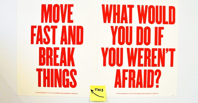
We got the answer. And it has everything to do with what makes Facebook Facebook.
Namely: testing, iteration & optimization.
Our Meetup with Facebook peeps
This week the Post Planner team in San Francisco was lucky enough to attend a Content Strategy Meetup where 3 Facebook employees were organizers & speakers.
 The Meetup covered everything from content marketing, voice & tone to content management systems (CMS), taxonomy & metadata.
One of the most fascinating presentations was given by Facebook's Marissa Gomez. Marissa manages the "micro-content" on Facebook's user interface -- the content that, if Marissa does her job well, you never notice!
In her presentation, Marissa talked about the challenges of creating & optimizing Facebook's UI content -- and gave an enlightening example about how it's done.
Hopefully you'll notice a pattern in this example -- one that will help you understand why you don't have the new News Feed yet.
Facebook Messenger: Iteration in Action
Facebook recently rolled out their mobile Messenger app, which lets you connect to & message people -- even if you're not Friends with them on Facebook.
 Basically, if you have someone's number & you're not Facebook friends with them, you can still search for them & connect with them in Messenger.
One of the challenges Marissa's team faced was how to ask new users to add their phone numbers -- so they could be searched for.
They couldn't just ask users to add their phone numbers without any explanation. They also had to explain some changes to their FB settings that would happen when they added their number.
So they had to:
- ask people to add their phone number
- explain the change to their Facebook settings that would happen after adding the number
- make the explanation crystal clear
- make the explanation NOT scary
Not an easy task, by any means!
They eventually settled on this UI text:
Add Phone
People on Messenger can look you up with this phone number. The Facebook setting for who can look you you up will be updated.
Continue
“We were just striving to be simple & straightforward -- so it just says 'Add phone' and explains that people can look you up with this phone... The caveat here is that your Facebook settings might be changing," Marissa explained.
“We presented this around the company to some of the stakeholders, and the feedback was that this was scary. Some people felt like they weren’t sure what that meant & also felt like it was kind of bland & didn’t have a lot of personality.”
Back to the Drawing Board
So Marissa & her team went back to the drawing board with hopes of making the content "a little bit more fun & human."
The designer's response was to add "a cute little graphic on there". And Marissa's team updated the copy.
“Instead of just saying, 'Add phone', which sounds like a strong command, we reworded it into a question: 'What number can people reach you with?'" Marissa said.
"We were getting at why you would need a number in the first place, but were also kind of softening it a bit."
They ended up with this UI text:
What number can people reach you with?
The Facebook setting for who can look you up by phone number will be changed from Friends of Friends to Everyone
OK
Again, they sought opinions from as many stakeholders as possible.
“We presented this around the company & people were still kind of skeptical," Marissa said.
"They were like, 'It’s cuter, it’s a little bit friendlier, but I'm still kind of scared. I don’t know what's going to happen with my phone number'"
Breakthrough
Then a breakthrough happened via some engineering know-how.
“We realized that with a little bit of engineering work we could tell you what your current setting is for your phone number on your Timeline," said Marissa.
The team felt this would make Facebook users more comfortable with the changes.
“We added a line about how only you can see your phone number on Facebeook -- as a way to end it on a good note & remind them that they had some reassurances.”
They ended up with this UI text:
What number can people use to reach you?
You don't have to be Facebook friends to get in touch, so your Facebook setting will expand to let anyone who has your number look you up with it. Only you can see this number on Facebook
OK
"We got rid of some of the language about the setting changing from Friends of Friends to Everyone & all that kind of stuff -- because we realized that people probably set that setting 4 years ago when they first signed up for Facebook & haven't looked at it since -- and don't remember what the setting was called or what the different options were," Marissa said.
"We just wanted to be a little more clear about it, and more straightforward in saying it will expand to let anyone who has your number to look you up with it."
Graphics were further "softened" as well -- and a lock icon was added to indicate when your phone number was not visible on Facebook.
“After many weeks & many reviews, this is where it ended up," Marissa said, displaying the final product.
“We felt pretty good about this when it went out, but I think it’s also something that we can always iterate on.”
Facebook writers & designers are still conducting user testing on it -- and are always reading online reviews of Messenger in the App Store.
“We have a saying at Facebook: Done is better than perfect,” Marissa said.
This is a great example of Facebook's culture of iteration & optimization in action. And it seems to have let to a positive outcome: a higher converting install process for the Messenger app.
Subscribe vs. Follow: User behavior as Feedback
 During the Q&A session after Marissa's presentation, Marissa had the chance to offer another example of Facebook iteration in action.
She was asked about an example of when everyone at Facebook thought they'd got something right, but were proven wrong by users.
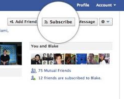
For Marissa, the first thing that came to mind was the Subscribe button that was added to user Timelines in 2012.
“You could go to people's profiles, like one of the big guys from The New York Times -- Paul Krugman or someone -- and if you weren’t his friend, you could Subscribe to his posts.”
The Subscribe button was a "heavily vetted decision" -- but the wording on the button still came "down to the wire".
"Down to the wire they were kind of between Subscribe & a few other words, and they were like, we’re just going to go with this," Marissa said.
But after surveying users about a year later, Facebook realized that people weren't using the new product much.
"And that was a time for us to say, yep, we made a mistake... wrong word,” Marissa said.
So they decided to ask some users the following questions:
- Do you know what this Subscribe thing is on Facebook?
- What does it mean?
- Are there other words you would use to describe it better?
“Basically it came out that everyone was using the word 'Follow' -- because that’s what has been the standard on every other app out there -- Instagram, Twitter, everything,” Marissa explained.
“And the numbers clearly showed it. Everybody was like, oh, Subscribe means Follow."
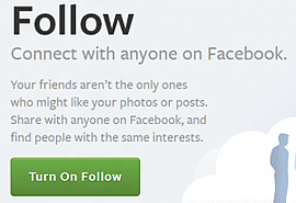 So Facebook's new Subscribe button was quickly relabeled Follow.
“We actually went out & we changed it everywhere on the site to Follow, and that’s what you see now,” Marissa said. “It’s much clearer & easier to understand for everyone."
The results were nearly as instantaneous as the decision to change the wording.
“We definitely had better comprehension. I think we still have work to do just as far as awareness of it,” Marissa said. “But at least they understand what it means when they see it on the site."
The moral of the story?
Without testing, it's easy to get things wrong. Even a single word. Even for Facebook!
So why don't you have the NEW News Feed yet?
As you can see from the examples above, Facebook is all about testing, iteration & optimization.
It's in the DNA of the company & seems to manifest itself in everything they do -- especially newly released features.
Like the new News Feed!
So why hasn't it been released to everyone yet?
Take a guess! :)
Yep, it's because Facebook is still testing, iterating & optimizing it.
That's the general gist of things, anyway. Here are some more details:
- Facebook is rigorously testing the new News Feed on the users who have it
- The highest priority is not to confuse users -- or make them have to search for the things they already know how to do
- They want the UI change to disturb users as little as possible -- ie. they don't want people to notice the change
- They're noticing that users are clicking less on certain elements & features -- an outcome Facebook wants to fix before a full roll-out
- For example, Groups aren't being clicked or visited as much -- probably because the Groups icon is being pushed too low in the left sidebar menu
- Many features are vying for the prime real estate in that left sidebar menu -- and anything that isn't higher up (like Groups) is getting fewer clicks
- Part of this is due to the fact that Facebook doesn't spend as much time & resources on Groups compared to other features -- although they do recognize how popular Groups are with users
So there you have it.
Basically, you don't have the new News Feed yet because Facebook wants you to be happy once you DO have it.
And you'll have it soon!
Yep, you will. So don't fret too much.
We'll all get the new News Feed once Facebook has iterated on it enough with the test users -- and once they've proven that users are using all the site features in a way comparable to the old design.
So be patient... it's coming.
And be thankful that Facebook approaches things this way. They have you, the user, in mind!


ViewHide comments (2)