 Have you seen the new Twitter profile design?
It’s getting mixed reviews.
Critics call the re-design a "facebookification" of Twitter.
I disagree.
Yes, Twitter now has:
- new "cover photo-ish" header images
- square profile photo in bottom left of header image
But this doesn’t mean the social network copied Facebook.
And whether they did or not, Facebook & Twitter are still very different.
>> Click to Tweet <<
With the redesign, I believe Twitter is trying to be more like the popular Chinese social network, Sina Weibo.
Here's an example of a Sina Weibo profile:

After all, Sina Weibo boasts some impressive numbers:
- 60 million daily users
- 130 million monthly users
Compare that to Twitter:
- 100 million daily users
- 215 million monthly users
- 500 million tweets per day
So how could the new Twitter profile design impact these numbers?
What the New Twitter Profile Design Means for You
For starters, here are the new features possibly coming to Twitter:
- Pin-to-top Tweets
- Tweet filtering
- Upload 2 photos
- Emoticons
- Web notifications
Despite these cool new features, I question whether the new Twitter profile is staying true to the "focus on mobile" philosophy we've all been hearing about.
It doesn't surprise me that Twitter has its sights set on mobile. Check out these numbers from 2013:
- 76% of Twitter active users were on mobile
- Mobile advertising accounted for more than 75% of Twitter's total advertising revenue
With the new profile, does Twitter hope users spend more time on their desktop computers?
>> Click to Tweet <<
The Bad News
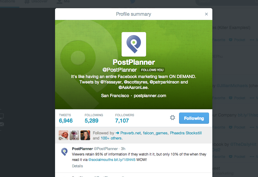
According to the book "Hatching Twitter", only a small number of people ever visit Twitter profiles.
And even with the redesign, I still see a pop-up window when I click someone's name -- instead of being taken directly to their profile page.
Why do I need to visit a profile if I can find everything I need in that pop-up?
What I Think of the Redesign
Here's what it looks like:
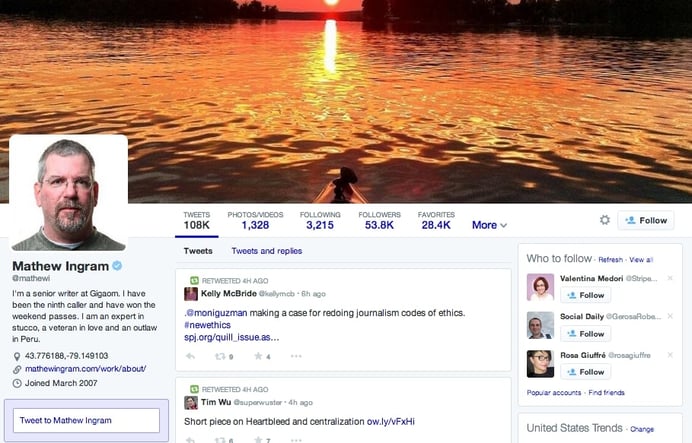
The new Twitter profile design may look nice, but we can't ignore the elephant in the room:
Twitter's real strength is mobile.
>> Click to Tweet <<
C'mon! 76% of Twitter users are on mobile.
Will the new Twitter profile get some of these people back to their desktop? Who knows.
Will you need to change your Twitter marketing strategy moving forward? Probably not.
Just add a beautiful Twitter header image to your page.
If you need some ideas, here are some tips for Facebook cover photos that you could easily apply to Twitter:
Will Twitter Engagement Increase?
If no one visits your profile, your level of engagement on Twitter won't really change with the redesign.
The new Twitter profile is fine, but how the social network will integrate the changes into day-to-day use remains to be seen.
I'm thinking the redesign won't prove all that significant.
What do you think of the new Twitter profile? I'd love to hear your thoughts in the comments below.



No Comments