 Want more clicks on your social media posts?
Want more shares and comments?
Then today's your lucky day!
I'm going to give you the secret formula for lighting up your social media channels.
And guess what?... It's simple!
Just create social media images that people love to share!
Sharing great images will boost your click-through rate (CTR) -- AND skyrocket your visibility and engagement.
So here's what you're going to learn in this post:
- 8 traits of successful social media images
- How great social media images can rule on ANY social media platform
- The secret formula for using #hashtags with images (don't tell anyone!)
Ready to get started?... Let's go!
>> Click to Tweet <<
8 Traits that ALL Successful Social Media Images MUST Have
Trait #1: Correctly sized
Each social media platform has its own preferred image sizes -- so you can’t take a one-size-fits-all approach to image creation.
Instead you need to make sure the image looks good on each platform. Otherwise, you run the risk of them getting cut off and looking like this one…
Is it a bird, plane, or a guy hugging a hose?
Nobody is going to want to click an image that has a cropped off head or only shows half a sentence. You can prevent that by knowing (and using) proper formatting.
Here are the optimum image sizes for each platform:
- Facebook: 1,200 x 628
- Twitter: 1,024 x 512
- LinkedIn: 800 x 800
- Google+: 800 x 1,200
- Pinterest: 735 x 1,102
- Instagram: 1,200 x 1,200
(for an in-depth treatment of the rationale for each, see this Kevan Lee deep dive on the best sizes for social media images)
Here's a disclaimer: Image requirements are constantly in flux. You can find different size recommendations just about anywhere (even in some of our own past posts).
Try the sizes shown and observe the results. If you have questions, use the Comments to let me know.
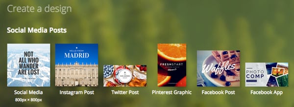
PRO TIP: If you’re designing from a template (like Canva) your dimensions will always be formatted to current guidelines.
>> Click HERE to shout out to Kevan Lee <<
Trait #2: Striking
Have you ever noticed how (after a while) everything in your timeline starts to blend together?
I bet if you were to go to Facebook right now and scroll down your Feed a few times... you’d forget at least 50% of what you saw (if not more). The exact SAME THING is happening to the content you’re sharing.
Your solution? That’s simple. You need to create what Seth Godin calls a Purple Cow -- an image that stands out and breaks up the Feed. The goal is to make your readers stop scrolling and take notice of what you’ve posted.
That may not be easy... but it is simple.
For example, an image like this may get lost:
But an image like this one below?
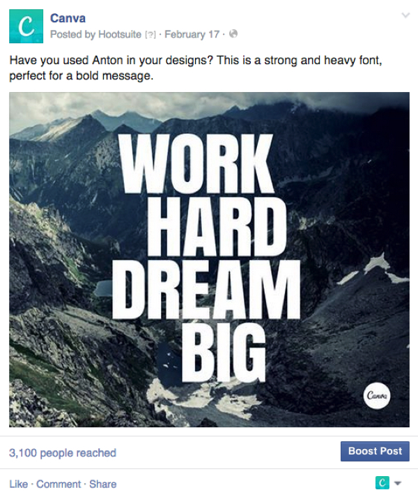
Well, that’s going to turn some heads.
To make sure your image is striking, consider these points:
- Don't use a corporate-style stock image
- Do ask "Is it relative to my topic and audience?"
- Do make sure the image has a bold focal point
- Do choose images that are clear and easy to view
- Don't do the same thing as everyone else in your niche
Be like Seth Godin -- BE DIFFERENT!
>> Click HERE to shout out to Seth! <<
Trait #3: Shows faces (preferably smiling faces!)
Cyrus Shepard saw a CTR boost of 35% simply by using a clearer picture of his own face.
People are fascinated by people -- and the people we like best almost always SMILE.
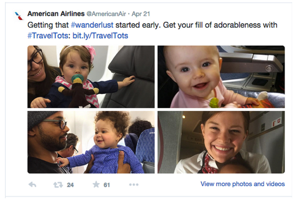
A great example of this principle is the American Airlines Twitter feed. They often show pictures of happy, smiling people -- and their interaction rate is incredible.
PRO TIP: Happy people looking directly at the camera is the key. When you look at someone, don't you like it better when that person looks back at you? I do.
>> Click HERE to give kudos to American Airlines <<
Trait #4: Leverages slogans & hashtags
Images are a great way to start a conversation.
The more you can get your audience involved in your story,the more they’re going to click through to your content and products. And there is nothing that quite holds social media together quite like slogans and hashtags.
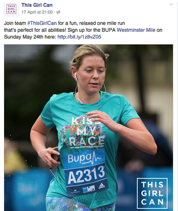
For example the #ThisGirlCan campaign (from the UK) focused on getting more women into sports. Their marketing strategy was simple:
- Use photographs of real women doing sport
- Include the #ThisGirlCan slogan and hashtag on every image
- Add a quote where needed
- Share the images across social media
The results were staggering. The media ate it up. Why?
Because the #ThisGirlCan concept is emotional, powerful and (don't miss this) because it started a discussion.
The right hashtag can move the world. What's your hashtag?
Trait #5: Leverages keywords & phrases
The words you use with your images must do 3 things:
- They must GRAB the reader's attention
- They must carry the reader's attention on to the next part of your message
- They must convince the reader there is a personal benefit (for that reader) in your content
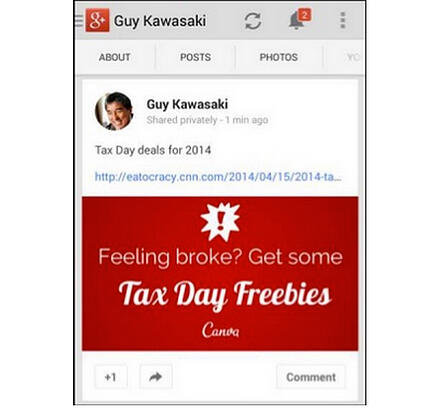
All of this is essential to getting clicks. Here's an example of how Guy Kawasaki creates visual content that gets results:
Trait #6: Consistency!
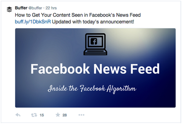
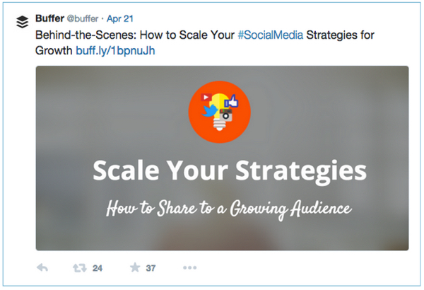
You want your readers to be able to recognize your images at 40 paces. That happens when you become known for a certain flair or style. It can be a function of your font, your colors, your subjects -- and probably a combination of all.
Buffer does this to perfection on their channels:
It's easy to tell when you see a Buffer image. You could pull them out mid-scroll in even the most hectic of News Feeds. They are unique, they are memorable -- and they are SHARED.
But how do you make your images consistent? Here are the basics:
- Use the same types of filters across all your images (or pick 1 and run with it if really want to be recognized)
- Use consistent font for each section of your images
- Create a brand style and use it constantly
- Own your branded colors and don't deviate (even slightly)
- Place a watermark – a logo, hashtag or slogan -- on all images
Trait #7: Relevance
Don't get waylaid by the simplicity of this statement. Go to your Page or channel and have a look.
How relevant are your images -- not to the post they are on -- but to your business?
- Are your images relevant to your brand?
- Do your images relate to your niche?
- Is it obvious (just by viewing your images) which product or service you offer?
Remember that people process images faster than words. If your images and your messages aren't congruent, they will be confusing (and your visitors are unlikely to stay long).
Trait #8: Can stand on their own (even as pure text)
Throw that stock image out the window. You're better off relying on pure text-based loveliness.
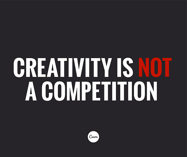
Text-based images are applicable in plenty of places:
- Share a quote
- Say something longer than word count would allow
- Quote fascinating facts to entice clicks
- Create a clickable headline image
- Publicize the benefits your content offers
Simple. Effective. Easy to create -- and highly shareable.
Wrapping It Up -- The ART of Getting Clicks
You don't have to take every one of the 8 points and implement them immediately. Rather, I suggest you try them one at a time and test to see how your particular audience reacts.
Build on what works best for YOU.
The more you know about your audience, the more clicks you’ll get.
Do you have other killer tactics you've found effective? Help a starving artist out... and share with us in the Comments!





No Comments