 I've "Liked" a lot of fan pages on Facebook -- about 3,000 so far. I do this so I can see how different pages are using Facebook.
For about 3 months now, I've been doing quick "Fan Page Reviews" every week to help Post Planner fans and offer actionable tips on fan page optimization.
What I'm noticing is that a lot of the pages I review (& follow) are making the same mistakes over & over again -- and I'm about to go all "Mr T" on them!
"I pity the fool that gets in my way!"
But seriously, I'm kinda bummed about seeing the same mistakes over & over again -- not because it means you're not reading my blog posts :) -- but because it means you're not getting the most out of your page.
After all, our goal at Post Planner is to make you a Facebook Guru!!
So with that said, here's this week's Fan Page Review:
Fan Page Review: Mr Bee's Appliance, LLC
Did you catch all of those things to stop doing on your page? If not, let me break it down for you one more time:
4 Things to Stop Doing on your Facebook Page ASAP!
1) Stop using low quality Cover Photos
No offense to Mr Bee's Appliance, but the cover image below leaves some serious room for improvement. The problem is it doesn't tell me anything about the brand and doesn't convey quality.
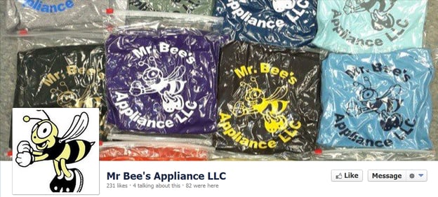
Your cover photo is THE place show off your branding -- in the most awesome & impressive way you can.
Sure Facebook made some recent changes to the cover photo guidelines that allow you to include more marketing call-to-actions, etc. But this doesn't change the fact that your cover photo is all about branding your business.
Think of it as the first impression someone gets of your biz. Kinda like the first impression someone gets of a restaurant when they walk in.
Do you want the potential customer to see a bunch of dirty tables & floors and an unhappy employee? Probably not.
Instead, you want them to see a spotless, friendly place with lots of smiling faces.
I grabbed one of the previous cover photos from Mr Bee's and placed it on a test page. While I'm not a huge fan of the orange bars on the image, just look how much better this branding is compared to the cover above.
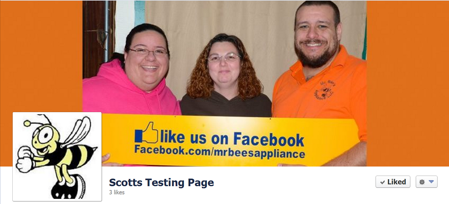
Plus, with the new way that "Like" stories are shown in the new version of the News Feed -- well, the bottom portion of this cover photo (with the Facebook url) is perfectly optimized for those stories.
2) Stop Leaving the "Like" app on Your Page!
This is something I've mentioned on every single Fan Page Review I've done.
The "Like" app -- with the thumbnail that shows the page's fan count -- is absolutely useless. It has no value for your fans and is a complete waste of the real estate on your Timeline. It doesn't serve any function other than to show off your fan count -- a count that's already shown on your page, directly below your cover photo.
Here's how to hide the Likes app by swapping its position with another app.
Step 1: Click the drop down arrow to the right of your apps and find an app to swap positions with your Likes app.

Step 2: Click the "Pencil" on that app and then choose the "Likes" to swap positions with it.
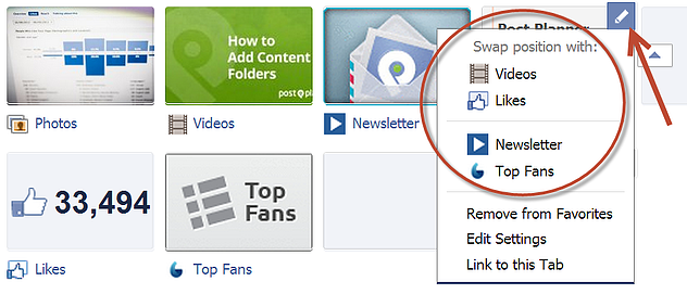
Once you've installed a few apps or loaded videos and/or events, you'll have enough apps that you can easily choose one to swap positions with the Likes app.
Trust me, you don't want this Likes app on your page. So please remove it.
3) Stop Installing Useless Apps on Your Page!
I'm a big supporter of Facebook page apps. I've marketed, designed & installed them on 100's of pages over the last 3-4 years.
But one of the worst things you can do as a page owner is leave an app on your page that:
- has outdated information on it
- has poor design
- doesn't function
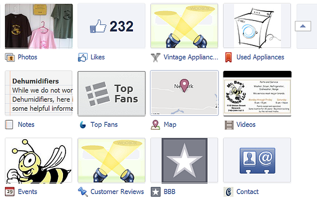
Above are the apps fans can see on Mr Bee's Appliance page. Most are ok -- but the "Used Appliance" one, for example, is very dated and no longer relevant.
Your goal with apps on your page should be to:
- Show off your products and services
- Run contest or promotions
- Gather leads
Other than that, installing 48 apps on your page won't benefit it in the post-Timeline era. So please stop installing every app you run across!
4) Stop Posting Long Updates!
Your #1 goal when running a page should be to get engagement with your fans -- which increases your Edgerank and the visibility of your future posts.
One of the best ways to kill your Edgerank is to post extremely long text posts that your fans don't read, and may even hide -- which again hurts your Edgerank as "negative feedback".
There are lots of theories about how long or short a post should be on Facebook, but my general rule of thumb is 80-120 characters. Yes I realize that's shorter than a tweet on Twitter, but in my experience it works.
Long winded posts can be good at times, but mainly for bloggers or personalities. The majority of us will get more bang for our bucks by posting shorter updates.
Think of long posts like long finger nails -- they may seem cool at first, but they usually end up creeping people out. :)
Note: if you need ideas on what to post instead, check out the following posts:
- Here’s What You Should Post on Your Facebook Page to Get More Likes & Shares
- How to Leverage the Status Updates of Top Facebook Experts
- Write better Facebook Status Updates with these 5 Templates
- 7 No-brainer Tips to Write an Awesome Facebook Post
That's all for this week. Please let me know in the comments below if you have questions or additional ideas about what NOT to do on a fan page.


ViewHide comments (2)