 You're on Facebook to do business, right?
Which means you're ultimately on Facebook to make more money.
I mean, you're not just doing this to distribute cat memes, are you?
Ok, some of you are. :)
But for those of you who are serious about making a profit on Facebook, please pay close attention to the recommendations I make in this blogpost.
If you don't, it could literally cost you thousands of dollars!
Below I'll be reviewing the fan page of Rod's Racers -- submitted by one of our fans.
ALL of the changes I recommend can apply to YOUR page too! And I promise -- if you make the changes, you'll see tangible results on your bottom line.
Make these Changes on Your Fan Page ASAP
1. Optimize your Cover Photo
With all the new changes to the news feed & cover photo layout -- it's more important than ever to take advantage of your cover photo real estate.
Make no mistake -- your cover photo is one of the biggest & best branding opportunities you have on the web.
Unfortunately, Rod's Racers' cover photo offers little branding -- other than the extremely fit (and somewhat out-of-focus) woman running along a bridge.
Remember: when someone Likes your page, a "Like story" shows up in the news feed of their friends. This story consists of a cropped version of your cover photo.
If the cropped photo says nothing about your brand, then you've missed a huge opportunity to grab new (and free) fans.
Here's an example of one of these "Like stories" (with effective branding):
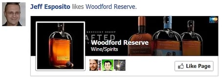
The exact slice of your cover photo that Facebook shows in these stories still seems to be changing.
Previously it was showing the lower portion of the cover photo -- but now seems to be showing the upper portion along with your profile image.
Here's what Woodford Reserve's full cover photo looks like:

And here's the "Like story" again:

Notice that brand's slogan gets covered up by the profile image -- which isn't optimal. But at least we see some repetition of the branded bottles -- and we know they're all about selling bourbon.
Compare the Rod's Racers "Like story". Here's approximately how it would look:

Not terrible... but it still seems like a missed opportunity to me.
The story as a whole (cover & profile image) doesn't tell me much about what Rod's Racers is -- nor the value they offer & why I should Like their page.
Also, the page name overlaps the lighter background of the runner in the cover photo -- and makes it hard to read.
Remember -- if I'm a potential fan seeing your "Like story" in my news feed, I want to be able to do the following instantaneously:
- read who you are
- know the value your page offers me
If I can't do these things in a fraction of a second, then I'll probably keep scrolling... and instantaneously forget your page instead.
If I do that -- if I forget you & don't Like your page -- then you probably won't get another chance to convert me into a fan -- and then from a fan into a customer.
That, my friends, is why having a great looking, high-quality cover photo -- along with a branded, relevant value proposition in the cover's upper half -- is crucial to your bottom line.
2. Optimize your Profile Image
 Your profile image is easily the most important image you have on Facebook.
It's what your fans (and other FB users) see in the news feed when you communicate with them.
My advice is to not clutter this image up with phone numbers, slogans, etc.
Remember -- your profile image shows up so small in the news feed (and even smaller in comments) that no one will be able to read any text in it -- nor will they be interested in trying.
For example, can you read any text here:

Rod's Racers would be much better off just displaying the 3 silhouetted runners in full size. At least that would be recognizable -- and thus convey information.
Remember -- the #1 place fans interact with your page is in the news feed -- not on your Timeline. So optimize your profile image for the news feed!
You can do this by making your profile image:
- high quality
- easy to read & recognize
- branded
- consistent across all social platforms (Twitter, Linkedin, Facebook, etc.)
If you follow major brands on Facebook, you'll quickly see that they almost all use their brand's logo as the profile image. They know what they're doing, in my opinion.
So please resist the temptation to add phone numbers, URLs, bullet points, etc. in your profile image.
Keep it simple, recognizable & branded.
3. Choose the Appropriate Category for Your Page
The category you choose on your page is ultra important. I've mentioned a few reasons why in a previous post on how to create a Facebook Business page.
What I want to focus on here is the difference between calling your page a "Local Business" or a "Company".
Below is the "About" section for Rod's Racers:

Notice anything wrong?
Yep, they're:
- listing a P.O. Box as their physical address
- not showing their website link
This is a real bummer, because Rod's Racers is missing out on a huge opportunity for people to learn more about them & also to click over to their site -- and it could be costing them thousands of dollars in lost revenue.
Plus, the whole reason to be listed as a local business is for people to find your location & check in -- which is impossible at a P.O. Box.
I'd recommend Rod's Racers:
- choose a different category
- edit their About section to show their website link & some keywords -- like we have on Post Planner:

By including a link to your site & great keywords, you will create more opportunities for people to find your site & page.
Do this asap! :)
4. Dump the Useless Apps
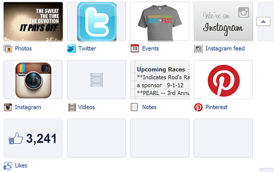
In my opinion, the most important goals of tab apps on fan pages are to:
- Drive traffic to your website
- Gather Leads
Anything else is taking up space & confusing your fans.
I know many "experts" love to recommend putting Pinterest, Twitter & Instagram apps on your page. But why? What is the real value of doing this?
My guess is you're just distracting the attention of your visitors & missing opportunities to get them to your website.
Now... if you want to post links to your Pinterest page in the news feed as posts -- then go for it! At least that's driving traffic to a destination.
But adding a tab app to your fan page doesn't do that -- and it probably won't result in repins, shares or more followers on those platforms.
Also... Rod's Racers has 2 Instagram apps on their page instead of one -- probably causing more confusion. If you can't live without Instagram on you page, then please only add one tab app with it.
And if you haven't added any new notes to your "Notes" app in over a year, then it's probably best to hide it. Nothing worse than someone visiting your page, clicking an app thumbnail & finding outdated information
The same is true with the Events app.
Remember -- with tab apps, less is more!
5. Stop Over Posting!
I'll be upfront here -- there's no "magic" number of posts you should be publishing every day.
But posting 20 updates in a 24 hour time period without getting much engagement may be doing you more harm than good.
For example, the content posted by Rod's Racers is very informative, but the engagement is low -- and I believe could be much higher.
The low engagement is probably a sign that the page needs to post less often in order to increase engagement.
*** If you are posting 20 times per day & seeing tons of engagement, by all means keep doing it!
Most pages however need to post less often so they can get users re-engaged with the page. This is a key factor in Edgerank -- Facebook's algorithm that determines what shows up in your news feed.
By publishing so many posts, most fans are probably missing the opportunity to engage with most posts -- and the less someone engages with posts from your page, the less often your posts will show up in their news feed later.
Sounds unfair, I know. But that's Edgerank, people!
My recommendation is to post at least 3 times per day -- morning, noon & night.
And if your page attracts fans from around the globe, you should be publishing your posts at the appropriate times in all time zones.
So... Are You Ready to Make More Money?
Cool. Me too.
So let's make these changes to our fan pages & stop burning the potential cash that could be in our bank accounts!


No Comments