 We've all heard it before:
You never get a 2nd chance to make a 1st impression!
I definitely agree with this. Especially when it applies to dating, job hunting, networking... and Facebook marketing!
Honestly, I usually think of Facebook cover photos when I think of first impressions. After all, your cover photo appears at the top of your page's Timeline (as shown in the example below).
But today I'm going to make a different argument.
I'm going to stick my neck out and claim that your profile picture (ie. profile pic) is actually more important than your cover photo for marketing.
Then I'm going to offer my best advice on how to optimize your page's profile pic -- so you can be sure you're making the best possible 1st impression on your fans and customers.
I look forward to a spirited debate on this one.
If you disagree, make sure to say so in the comments below! ;)
Your Profile Pic is *Waaay* More Important Than Your Cover Photo
Though a nice cover photo like Post Planner's is key to any Facebook marketing strategy, I think your profile pic is even more important.
First, Let's Review the Guidelines
Facebook offers these instructions for creating your profile pic:
Page profile pictures are square and display at 160x160 pixels on your Page. The photo you upload must be at least 180x180 pixels. We recommend uploading a square image. Rectangular images will be cropped to fit a square. Your Page's profile picture will also display next to your Page's name around Facebook to represent your Page.
So in a nutshell, Facebook's image dimensions say your profile picture should be:
- square
- at least 180 pixels wide and 180 pixels tall
- not a rectangle (or it will get cropped)
If you want to get creative and work the profile image into your cover shot, Facebook also provides guidelines for doing that:
You can be creative with how your Page's profile picture and cover photo go together. On your Page, the profile picture is located 23 pixels from the left side of your cover photo and 210 pixels from the top of your cover photo.
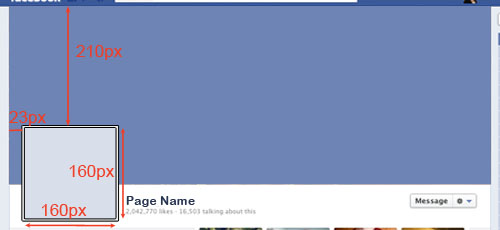
But I wouldn't bother doing this unless you have a graphic artist who can really make the design functional and visually appealing.
Remember: hardly anyone will see your creativity anyway -- since it's rare that someone visits your Timeline directly.
Why Your Facebook Profile Photo Is So Important
OK, now for the crux of my argument.
I think your Facebook profile picture is more important than your cover photo because it's the image that represents your page throughout Facebook -- to your current and potential followers.
Your profile pic appears in:
- the News feed of your followers
- Posts on your page's Timeline
- Replies in comments
- Comments & posts you make on other pages while using your page
- the Cover photo on your Timeline
The most important of these is #1, of course -- the news feed of your followers.
Above all, you should be designing your profile pic for THAT location.
And while you may think it's cute to have a pic that's funny or witty -- most companies just can't pull this off without looking a little ridiculous.
So stick with a high-quality photo or logo that brands your company well!
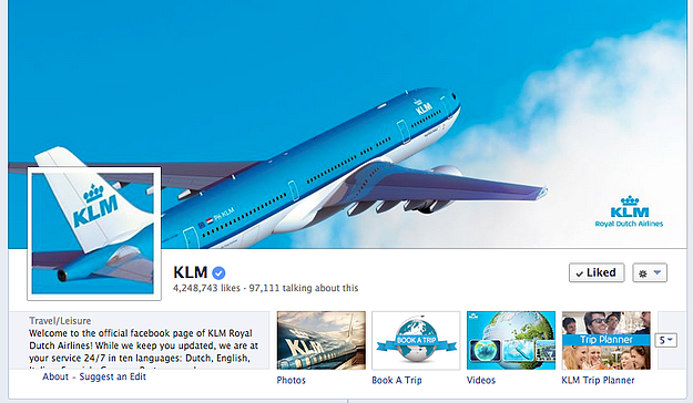
If you're determined to go the fancy route, find an artist to design your profile and cover image together -- like this stunning example from KLM:
And if you want to see more awesome cover photos like this, please read this post:
Optimize Your Profile Pic for Different Sizes
Combining your profile picture with your cover can create a cool design. But you need to make sure the profile pic can stand on it's own -- since that's what it will be doing 99% of the time.
For KLM, here's how the full-size (180 x 180 pixel) image looks:

Here's how the 160 x 160 pixel image looks:

Keep in mind that the only time anyone will ever see this "full-size" profile picture is when they visit your page's timeline -- which honestly doesn't happen very often.
So the smaller versions of your profile pic are MUCH more important to optimize!
In the news feed of your fans (again the most important location on Facebook!), your profile pic appears much smaller -- about 100 x 100 pixels. Like this:

And it appears as 86 x 86 pixels when viewed on your posts on Timeline:

And even smaller next to comments -- 43 x 43 pixels:
![]()
Now you see why Facebook pages that succeed tend to have high-quality, clearly branded profile pics.
Because no one reads (or wants to look at) a profile pic cluttered with tiny, indecipherable text.
And honestly, using a profile pic that can only be recognized in combo with your cover photo will just confuse your fans.
So don't do it!
Recommendations for a Strong Facebook Profile Pic
Here are my tips for creating a great looking profile pic that your community will recognize immediately:
- Use your logo if you have one >> Click to Tweet
- Minimize or eliminate all text >> Click to Tweet
- If you're a business or brand, don't use a headshot (unless it doubles as your logo) >> Click to Tweet
- Don't change it very often -- consistency is the name of the game! >> Click to Tweet
- Use an image that is recognizable on all social platforms >> Click to Tweet
- Never use stock photos! >> Click to Tweet
- Make sure it's square >> Click to Tweet
Can't Resist Getting Creative?
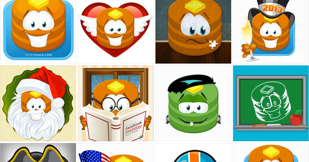
I found an exception to my rule of not changing your Facebook profile image very often -- and it's ShortStack!
These guys do an awesome job rotating profile pictures on their Facebook business page to match different seasons and holidays:
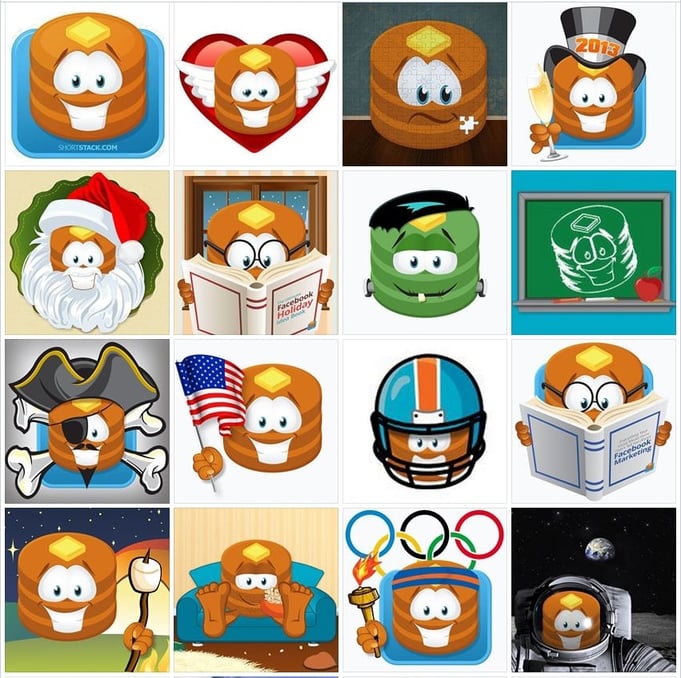
But notice how ShortStack's recognizable logo/mascot is the central theme of each image. This is key if you plan to change your profile pic very often.
ShortStack has succeeded in maintaining strong branding while also being creative and having fun.
CAUTION: most pages can't pull this off!
Disagree?
If you disagree with my advice, or want to seek out more information on your own, here are some helpful places to start:
- Use Timeline Slicer or 5 Minute Cover Photo if you’re not a designer
- Examples of less than stellar profile pics
- Facebook’s Help Center has great tips on profile pics



ViewHide comments (4)