 If you're reading this article, you probably need help with your Facebook page.
No worries. That's what I'm here for. ;)
Today I'll be reviewing a page about fashion -- and offering a few tips you can apply to your own Facebook strategy.
I'll cover everything from crafting a great cover & profile pic to adding apps to your page to capture emails or host a contest.
And for the fellas out there -- you may even pick up a fashion tip or 2!
5 Dapper Facebook Lessons from a Fashion Page with Chops
I'm always on the lookout for pages to review for Post Planner's blog.
I may even review yours if you tag or post the URL in the comments on this Facebook update:
One of these requests came from Men's Style Lab:
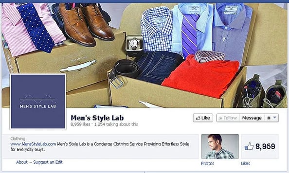
In the spirit of full disclosure: I have no style!
I typically wear torn denim shorts, a hoodie, a cap or visor, and worn out sneakers.
Obviously, I could learn a lot from this page!
But today let's examine the great stuff Men's Style Lab is doing on Facebook, and ways the company could improve.
1. Awesome Cover Photo
This page does a fantastic job using a photo to showcase the business -- and without a bunch of unnecessary text.
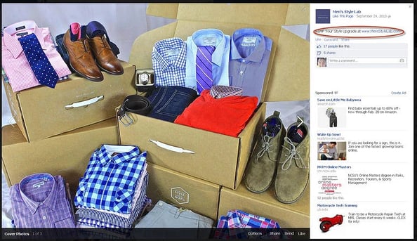
The cover photo quickly tells me the following about the company:
- Focus is men's clothing
- Watches & belts are priorities
- Shoes are key
- Orders are delivered in a cool box
All that from the cover photo -- without saying a word.
Brilliant image!
They also added a brief description & website URL to the image, which is something most pages don't do.
Well done!
2. Simple, Yet Effective Profile Image

This profile image is simple, clean & EFFECTIVE.
The name & logo are prominently displayed & are easy to recognize in my news feed.
The image is also consistent with branding on the website -- which is key!
Only thing missing? A description & website URL just in case someone clicks it:
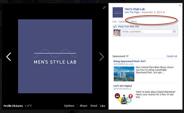
Adding a description & URL to your profile pic provides additional branding opportunities & a chance to drive traffic to your website.
>> Click to Tweet <<
3. Complete About Section
Surprisingly, many page owners overlook the About section -- even though the information is crucial.
Men's Style Lab breaks that mold:

They include a URL right up top -- which provides ANOTHER way to drive traffic to their site.
>> Click to Tweet <<
These guys get it!
The section also has a brief description of the company. One sentence tells me exactly who they are.
Clicking anywhere in the About section or the "About" link takes me to a page that provides even more info:
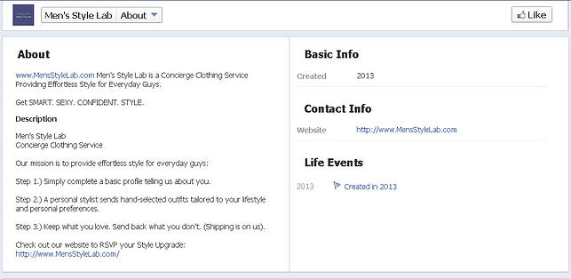
The About section that appears on your Timeline is a short description that you edit in your page settings. The longer About section is only seen when someone clicks the About link.
One thing to point out here is that Men's Style Lab has a line that reads "Get SMART, SEXY, CONFIDENT, STYLE." in their short description.
But I only see this displayed in the expanded view -- not on the Timeline.
That's because they added a hard break after the first sentence. Had they instead used a space it would have looked like the example below (which is probably what Men's Style Lab had in mind):

This tagline is obviously important -- and if the hard break is deleted people will see it on the Timeline.
4. No Page Apps -- No Bueno!
 There are no page apps on the Men's Style Lab page -- a bad move.
Page apps are an essential part of any successful Facebook fan page.
>> Click to Tweet <<
Why?
Because you can use them to:
- Run contests
- Get newsletter signups
- Showcase products
- Drive traffic to your blog or website
- Show off your Tweets or Instagram photos
- and much more
If nothing else, use your Facebook page tab apps to at least collect emails from fans.
>> Click to Tweet <<
Setting up an app isn't difficult -- there are many app providers with templates. You simply input the info & publish it on your page.
I've used many -- and the ones I recommend the most include:
Once you install a couple apps on your page, you can hide that useless (and tacky) Like count thumbnail from your Timeline -- replacing it with a visible app that hosts a contest or links to your Twitter account.
5. Posting Strategy: the Good, the Bad & the Ugly (hashtags)
Since this page & company are fairly new, they're probably still learning what works & what doesn't work on Facebook.
The focus is primarily on posting quality photos that relate to men's fashion -- which they do quite well:
Every day they post high-quality images of clothing & men wearing dapper clothes.
I do see 2 problems, however:
- Not driving traffic to the website
- Overusing meaningless hashtags
Driving traffic to your website
The vast majority of their photo posts do not include a URL in the description.
Now I understand that photo posts are not about driving website traffic, but if you post photos about your product you might as well include a URL to get some clicks.
I found a few link posts that went to their blog -- but otherwise I saw no real strategy to drive traffic to their site.
This should be a top priority for any business on Facebook!!!
Remember, you need to chum the waters & then add baited hooks!
Sure you want photos & text updates that get engagement from fans -- but you should also mix in posts with links to your website -- posts that drive traffic & generate ROI.
Using fewer hashtags
Don't use so dang many hashtags!
>> Click to Tweet <<
Hashtags on Facebook have not worked like many thought they would or as they do on Twitter.
They're useful for people searching for info on a specific subject.
 But on Facebook, people mostly want updates from friends & family. Most aren't searching for the latest trending topics.
Hashtags on Facebook are fine -- just make sure they make sense & are useful for those looking for more info.
Here are some of the less useful Facebook hashtags Men's Style Lab used on posts:
- #MensStyleLab
- #StyleLabApproved
- #SockSunday
- #StyleLabThoughts
- #TieTuesday
- #ManCaveMonday
- #MensStyleGirl
- #WatchWednesday
I get that they are trying to create a trend, and are hoping others pick up on these hashtags & use them. But when I click these hashtags I only see posts from this page -- nobody else.
I see every "SockSunday" post from the page when I click the hashtag, and maybe that's their goal.
I just don't think people are using the hashtags very often -- and that they may detract more than they help.
For example, on this post I'd add more text.
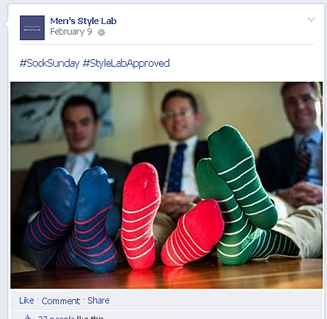
I'd use a strong call-to-action question instead. Something like:
How many of you are rocking killer socks on #SockSunday!
The key is brevity & providing call-to-action or stimulus for engagement.
Just adding hashtags on every post won't increase engagement -- which we all want to do.
In Summary
Overall, I really dig this page & the company.
They are doing a great job with their:
- Cover Photo
- Profile Image
- About Section
They could work on:
- Installing Page Apps
- Improving the Posting Strategy
- Boosting Engagement
What do you all think of this page? Let's hear your critique.
Post some tips for the page owners in the comments below!


No Comments