

Visual content is like music.
In a flash, it connects you to a moment, message, and experience.
And like a song, images are sticky...
...Hanging around long after that first interaction.
Just think about it:
Visual marketing is to you what music is to an artist.
A virtual calling card.
An instant association with your business, giving voice to your content.
And with visuals earning a whopping 94% more shares than any other type of content...
...Adding a visual marketing plan into your social media isn't an option. It's a necessity.
So stop procrastinating. It's time to get visual.
Below are 9 ways to use visual content in your social media strategy.
Use one or use them all:
Guaranteed that they'll keep your audience coming back for more!
And make sure to watch a replay of our full webinar with tips on how you can use Canva and Post Planner to rev up your visual marketing!
9 Ways to Use Visual Content in Your Social Media Strategy
1. Use the 3 Types of Content Your Audience Craves
Your first step in creating visual content that resonates with your audience is using the 3 types they want to see.
1. Content That Educates
This is the number one content marketing choice for most B2B and B2C businesses.
Have a long sales cycle? Want to walk your customers through their buying journey?
Educational content can help your prospects move through the consideration process...
...And at a faster pace.
Share content that helps your readers evaluate their options. It should also elevate the experience around your business.
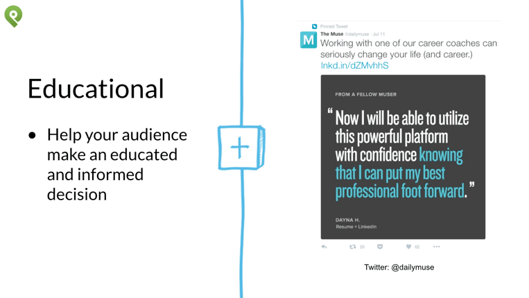
Look to "The Muse" and their use of this type of content. They use a short amount of context to set up a testimonial.
Rather than patting themselves on the back, they let their customers do the talking.
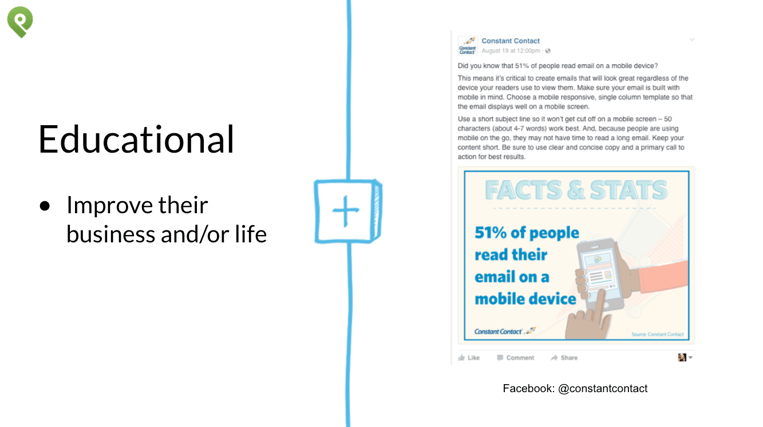
Constant Contact is another example of using educational visual marketing to create stickiness.
They get their audience, know what they're looking for, and use images to connect the dots.
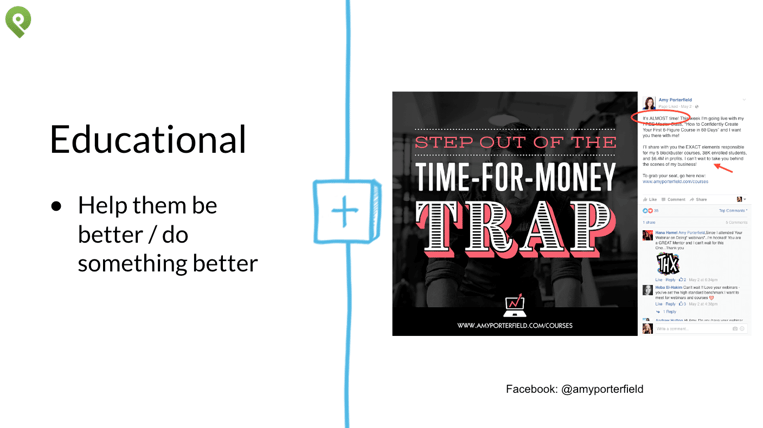
Educational content can also help your audience be better or do something better.
Amy Porterfield uses this tactic with visual marketing frequently. She taps into the struggle or pain of her audience and then provides the solution.
Use your knowledge and skills to translate those benefits into bite sized visuals.
2. Content That Entertains
People love entertainment. From Gifs to Memes, this type of content is heavily shared across social media.
But what if you don't feel comfortable with funny, silly or amusing content?
What if you're a serious brand and don't think it aligns with your business?
Sure, that could be the case. But I doubt it.
You just haven't found a way to inject entertaining posts into your layered mix of social content.
It usually involves videos, comic strips, images and webisodes. It can also be touching, heartwarming and inspirational.
Whatever the case...
...It’s always likeable, shareable, and often the most engaging content on social media.
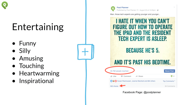
At Post Planner, we've cultivated an audience that appreciates our sense of humor.
You need to do the same. Give your audience a unique glimpse into the other side of your brand.
3. Utility Content
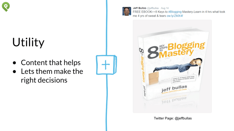
Utility content helps your audience do certain things and make the right decisions. This type of content does not tell stories – it gives users tools to get from point A to B.
Utility content is what your fans and followers need to make an informed decision.
Jeff Bullas shows us that utility content is useful...it's helpful.
It's an Ebook or whitepaper or epic blog post that includes a download.
So, which type of visual content sounds most appealing to your audience?
Your goal is to choose one and create unique content that becomes the show to your tell.
2. Create the Ideal Length Post to Capture Attention...Fast!
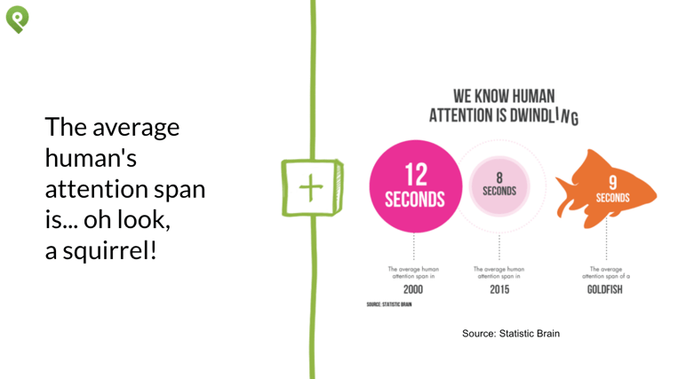
The average human's attention span is... oh look, a squirrel!
And sadly, scientists have confirmed exactly that.
The age of smart phones has left us with such a short attention span...
...That even a goldfish can hold a thought for longer.
Yikes!
The average human attention span: 8 seconds.
Goldfish, meanwhile, have an attention span of 9 seconds.
So what can you do to pique audience interest?
Keep your content snappy!
Use a tool like Letter Count to write your posts.
But more that, know the best length for social media posts.
Hubspot found that these max characters work best for Facebook and Twitter.
-
Ideal length of a status update: 40 characters.
-
Ideal Tweet Length: 100 characters without a link; 120 characters with a link.
-
Ideal Hashtag Length: Under 11 characters; shorter if you can. Use 1–2 hashtags per tweet.
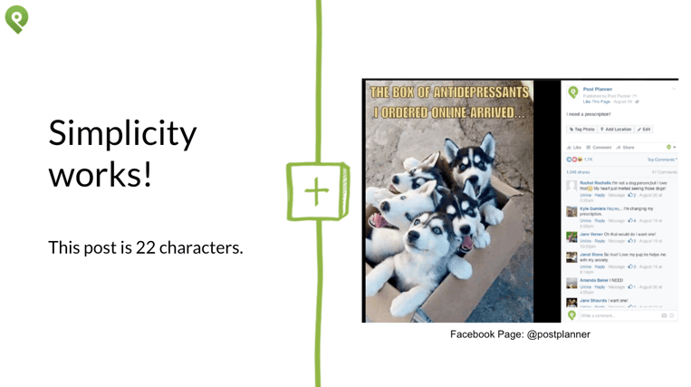
And we've proven time and again that simplicity wins.
This post is only 22 characters.
3. Create a CTA People Get Excited About
With over 4.75 billion pieces of content shared daily on Facebook alone, how do you get seen?
Get specific.
Because without a clear call to action, your fans and followers have no directive.
Should they comment, click, like, share, retweet? Or do they simply read and move on?
More than likely, the latter is happening to you.
And if a call to action makes you squirm in your seat. If you're shouting at me right now saying...
...But I don't like to be overly promotional or in people's face.
To that I tell you:
Get over it.
This is YOUR business. Tell people how you help and where you want to help them.
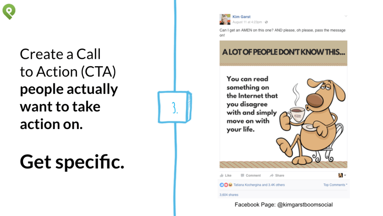
Take a tip from my friend Kim Garst who knows how to direct her audience.
Now put your call to action into play.
-
Create appealing images that get people’s attention. Then drive them to your website or landing page.
-
Include a call to action in your visual like, "click here" or "download." This is your chance to redirect the user to your website, blog, or event.
-
Create cover photos that tell your followers what next step to take. Add an easy to type URL to your image which leads to your contact form or squeeze page.
Bottom line?
Never miss an opportunity to specify what you want your followers to do within that post.
4. Find the Perfect Quote or Status Idea for Your Graphic
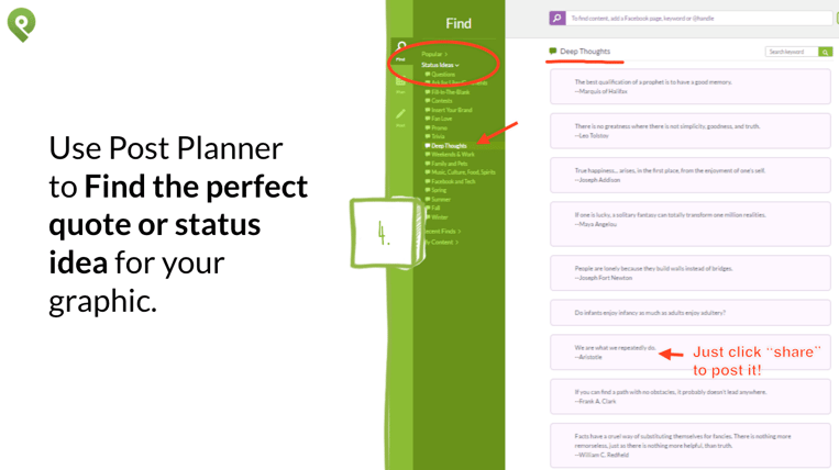
In Post Planner, you gain access to thousands of pre-created texts you can drop into a graphic.
With everything from questions to quotes, creating branded content has never been easier.
-
Start by browsing through Quotes in Post Planner’s “Popular” section. Find one you love, drop it into a pre-created template in Canva, right within Post Planner!
-
Browse through the 15,000+ status ideas in the Post Planner Status Ideas Engine. You can search for: Inspiring quotes, Fill-in-the-blanks, Questions, etc.
-
Copy and paste the text from the quote or status idea onto a Canva layout.
-
Add your quote, question or idea into a pre-created template. Now drop it into your queue and it's ready to post to Facebook or Twitter!
-
-
Now add that to one of Canva's free, ready-made templates.
-
There are lots of exciting free and paid backgrounds and text overlays. Choose a template that suits your text or status update and paste the text into Canva. Make any changes if needed, and post or schedule the image.
-
Use Canva to create optimal sized images for each platform. You can also use Canva to crop the image later in order to Maximize Copy Space (empty areas within images).
-
When searching for background images, look for ones with ample space that you can use to overlay text. You can also create more white space by enlarging your images.
5. Brand Images and Create a Consistent Look
-
Choose Consistent Elements to Enhance Your Branding. Achieve visual recognition by using repetitive placement of text, and through the use of the same typefaces & color palette.
-
Pay special attention to color. Pick specific colors for your logo and brand style. Different colors have different meanings and evoke specific feelings.
-
Add a logo or website address to your images to brand them as yours.
Now Use Canva’s tools for advanced branding
-
Pair Contrasting Fonts. Which fonts look good together & which ones don’t? A great rule of thumb is to choose fonts with high contrast. This will help the fonts balance each other out while still creating a feature in your design.
-
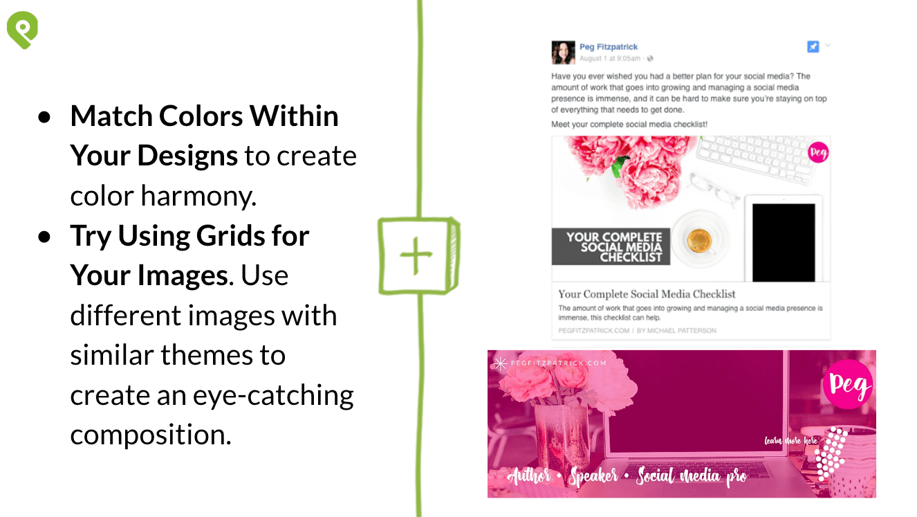
Match Colors Within Your Designs. Creating color harmony is one of the most effective ways to make your designs stand out.
-
One way to do that is to match the colors you use for your graphic elements -- such as fonts or text holders -- with a background image.
-
A great example of this is Peg Fitzpatrick. Her signature pink and vintage elements touch every aspect of her brand.
-
-
Use Grids for Your Images. You can use different images with similar themes in a grid to create an eye-catching composition. Consider applying a unique filter across all the images for consistency.
6. Repurpose Content Into Short Graphics or Infographics
Create branded graphics by repurposing content from your blog posts, webinars, or other events.
This is an easy way to make what was old, new again.
-
Infographics are a visual representation of data and are 30 x's more likely to get read than a purely textual article.
-
Add credibility and reliability to your posts with charts, data, tables and graphs. Canva has many shapes and icons tools you can use.
-
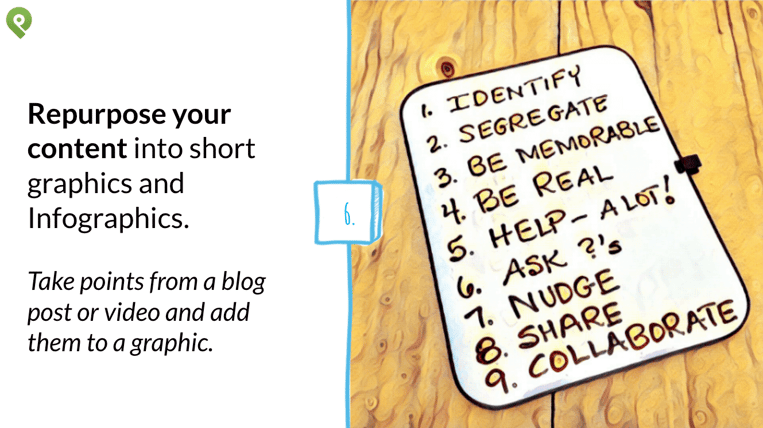
Take points from a blog post or video and reframe it like I did here. These were notes from an interview I did with Konrad Sanders.
-
I took those notes, added them to my white board and transformed them through the visual app Prisma.
7. Create Thumbnails and Intro/Outro Slides for Your Videos
Are you branding your videos with customized intro and outro slides?
No? You're missing a huge opportunity!
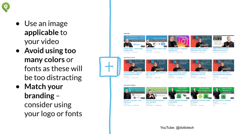
Take a look at how Steve Dotto at DottoTech, his slides are complementary of his branding.
No matter where you find him, that look and feel remains the same.
-
Canva has templates you can use to create thumbnails and slides for videos. Just choose “YouTube Thumbnail” or “Presentation” as the design type.
-
When creating the thumbnail or intro slides, make sure to use an image applicable to your video.
-
Avoid using too many colors or fonts as these will be too distracting.
-
Match your branding, using your logo or fonts.
8. Design an Email Header for Your HTML Templates
Long gone are the days when a great email was text alone — today’s e-mails need to snap, crackle, and pop. - via Canva
Canva's simple drag-and-drop design tool makes it easy to create an email header that will make a great first impression.
You can find header templates by selecting the “Email Header” design type.
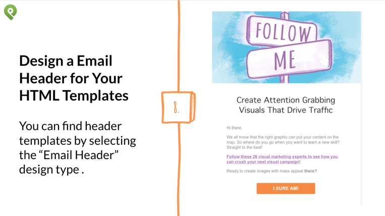
And bonus: if you need to create a newsletter quick, just duplicate your design, edit the necessary parts, and you’re done!
9. Give Evergreen Content a Fresh Face
Want to keep evergreen content in front of your audience?
Give it a fresh face!
Here's where you begin. Go to Google Analytics and find your top trafficked content.
Take a look at what content is your Top 10 performers of all time.
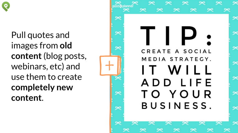
Now go through and pick 2-3 quotes out of each one.
Those become quotes or tips you can add to an image.
In an instant, you've transformed that text post into a visual marketing masterpiece!
Final Thoughts
There's no doubt about it.
Visual content is a powerful way to convey your business message, vision, and mission.
From ideas to strategy, adding visual elements elevates the conversation around you.
So stop worrying and start doing and make a commitment to consistency.
Pick your favorite tips and add those visual marketing ideas to your content strategy!



ViewHide comments (4)