 You could spend hours creating visual content.
Tweeting it up like a storm.
You could even hire a designer and whittle away your budget on one creative after another.
Or, you could save your money and your time and find an easy solution to use visual content on Twitter.
Because, let’s face it — visual marketing is hot.
And I don’t mean your average hot. It’s holy momma, “this content has fire power” kinda hot.
Know what I mean?
But let me guess…
You’re still not convinced.
Sure, we’ve discussed reasons to use visual marketing on Twitter for years. But there you sit, stuck on the fence.
And don’t pretend you haven’t seen the convincing data.
- Humans process visual content 60,000 Xs faster than text.
- Content with relevant visuals gets 94% more views.
- Infographics are liked and shared on social media 3X more than other any other type of content.
- Blah, blah, blah. More reasons why you should be using visual marketing to your advantage.
So, what do you think? Let’s end that cycle today.
First, you need to tidy up your Twitter timeline. (stop tweeting crap no one wants to read)
And second, you're going to start using visuals on Twitter the right way.
Deal?
Here’s 21 ways you can use visual marketing to brand your business and captivate your Twitter audience.
21 of the Most Powerful Ways to Use Visual Content on Twitter
21 of the Most Powerful Ways to Use Visual Content on #Twitter - http://bit.ly/1ZUidMI (by @RebekahRadice on @PostPlanner)Click to Tweet1. Make your visual posts attention grabbing
The more compelling, original, and eye-catching your visual content, the more likely it is to get noticed.
Engage your audience and don’t bore them with the same type of content they see everywhere else. Make it unique to your brand, entertaining and rich with your tone and voice.
Airbnb is an example of merging the perfect image with relatable (and engaging) context.
Now all you need is your wingman and some aviators. Happy #TopGunDay! https://t.co/A6AkQcwUz0 ✈️🏡 #LiveThere pic.twitter.com/JC2Bsh0nsy
— Airbnb (@Airbnb) May 13, 2016
2. Add your logo or website address to your images
This small step will only take you a minute, but will build brand recognition.
It also makes it easy to see (no matter where the audience connects with you) that the image is yours. This improves awareness and prevents others from swiping and using it as their own.
Another alternative is a simple variation on your logo or a watermark. This creates a uniform and consistent look and feel.
Peg Fitzpatrick created her own right within Canva. Her circular “Peg” shows up on everything from presentations to social graphics.
How #SocialMedia Can Be Magic For Your Blog [new article!]
— Peg Fitzpatrick ✨ (@PegFitzpatrick) February 22, 2016
Read it here: https://t.co/7bT5cKGO2q #smtips pic.twitter.com/Wqde7RpIcf
3. Post shareable images
Funny photos and images with inspirational quotes or tips are the easiest to create and to share.
They are also incredibly popular on Twitter due to their simplicity. In a snap, you can click retweet and pass them along!
Think about what type of shareable content would resonate with your audience. Now you can create those images or (even better) leverage other people’s content.
I do this daily within Post Planner. Go to Find — Quotes and look for 5 stars. In a matter of moments, you’ve added scientifically proven content to your Twitter feed!
The same boiling water that softens the potato hardens the egg. It's about what you're made of, not circumstances. pic.twitter.com/1ZZr6XucxG
— Rebekah Radice (@RebekahRadice) May 20, 2016
4. Combine images with text to create visual content that is appealing and informative
Did you know that an estimated 84% of communications will be visual by 2018? It’s easy to see why pretty pictures are great for attracting attention.
But they’re so much more.
They’re also a means of communication. A way for you to impart what your brand is all about.
Combine beautiful images with a bit of informative text. Or use text to ask a question, share a quote or help get your point across.
This is a tactic used by TripAdvisor on a frequent basis. They ask a question and then share a relatable image and quote to boost engagement.
Have you traveled to a place that took your breath away? Tweet us about it! #WhyWeTravel pic.twitter.com/pkEdxNOLDV
— TripAdvisor (@TripAdvisor) June 9, 2016
5. If the image includes text, make it concise
We live in a fast paced and hectic world. Most users don’t have the time or the patience to read long chunks of text.
I don’t know about you, but my tweeting time is limited. I’m scrolling fast to catch up on all that my friends and peers have shared throughout the day.
If you want to capture my attention, make your images easy to digest.
What do I mean? Keep them bite sized. Simple text on top of a non-competing background.
Think clean, crisp and readable. No fancy fonts or hard to read text.
6. Get creative with your visual content
Even if you’re not a designer and lack any artistic skills, you can create visual content.
With the abundance of visual creation tools, making a branded graphic has never been easier.
Canva, Relay, Adobe Spark and PicMonkey are just a few of the tools that can do the heavy lifting for you. Rather than start from scratch, build out your go-to templates.
Add your logo, customize your brand colors, choose a font and off you go. Now tweet it, track your results, tweak it or rinse and repeat.
All the benefits in half the time!
7. Use infographics to display examples and how-to’s
Did you know that an Infographic is 30 x's more likely to be read than a purely textual article? While Infographics can take some time to create, they have proven to be successful time and again.
So, why do we love them so much? Infographics are a visual representation of data. They're clear, concise and easy for readers to understand. We can browse, get the details we're looking for, share and move on.
If you're not sure how to use them, just think about your audience. What type of “step by step” or “how to” graphic would appeal to them?
At Post Planner, we use Infographics in a variety of ways. Within our marketing campaigns, to repurpose a popular blog post or highlight an event.
You can see the full version of the example below at How to Use Social Media for Your Small Business [Infographic].
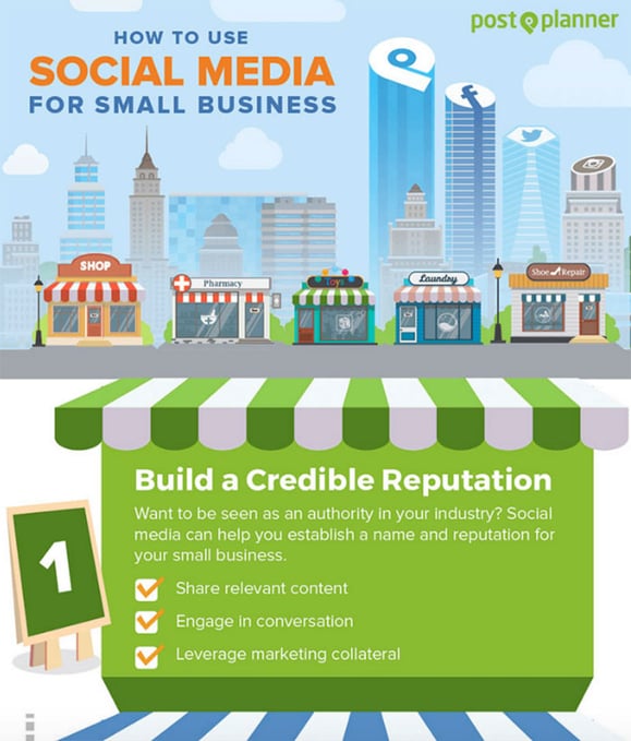
Whatever you do, don't make this process difficult. If you're not visually inclined, turn to sites like Upwork or Visual.ly.
If you're a do-it-your-selfer, Piktochart and Vengage make the process effortless.
8. Include a call to action in your visual
According to Twitter, tweets that ask followers to download from an included link increase URL clicks by an average of 13%. Not too shabby for a simple call to action.
A call to action like the one above is your chance to redirect the user to your site, blog, or event.
Never miss an opportunity to specify what you want your followers to do. Why assume when you can spell it out in no uncertain terms?!
9. Get great creative commons images from reputable sources
Pulling images from the internet and posting them to Twitter can be dangerous. You could face a copyright infringement and hefty fees.
Stay safe and only use images you know fall under a Creative Commons License.
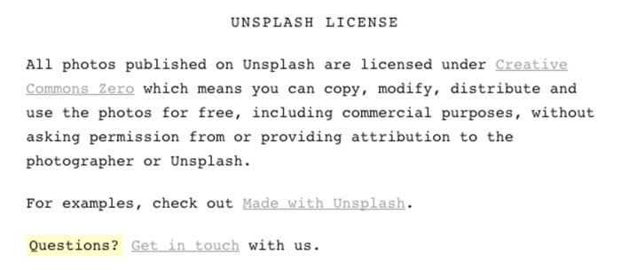
Look to respectable image resources that prominently display their license terms. Unsplash shares license terms along with a link to the Creative Commons website.
10. Have your designer create a template
It can be quite expensive to get your designer involved every time you want to create a graphic.
Instead, create several variations that will allow you to change them up as you see fit.
Design one template that lets you add a new background image, text or other elements. Drop in your quote, tips or stats.
Voila! You have a branded design that's 100% original at a fraction of the design time.
11. Use visual content to give evergreen content a fresh face
You wrote an awesome post. In fact, 2 years later, it's still churning out traffic.
That's the beauty of evergreen content. Problem is, tweeting it over and over can feel redundant.
But keeping that content out in front of your audience is an important part of social media marketing. What's a marketer to do? Give it a fresh face!
Use images from the sites I mentioned above or create your own design. Use 3-5 different visuals on the same tweet and test which performs best.
Your post now looks like a completely new tweet, keeping your timeline from appearing stale.
12. Make sure your visual content offers something valuable (stop over-asking)
Your Twitter followers don’t want to feel sold to any more than you do. Stop beating them over the head with promotional tweets.
Don't get me wrong. Share your latest product or service. Just don't do it in every tweet.
Limit your “buy this” and “click here” posts. You know how that makes you feel, right? Irritated and ready to unfollow.
Replace them with content that's valuable. Become a resource and one that gives followers exactly what they're looking for.
Attract your ideal customer by providing quality content. When you do, engagement naturally begins to improve.
As the saying goes, "you'll attract more flies with honey than vinegar." The same holds true for your Twitter content.13. To get maximum visibility, tweet your visuals at different parts of the day
Did you know that the average lifespan of a tweet is a mere 18 minutes? That's a small amount of time to gain the attention of your audience.
Think about it. If you only post during your waking hours, how many people are missing out on your content? By the time they've logged in, your content has blown away in the Twittersphere.
Look to a tool like Tweriod to determine your best times to post.
Now add new times throughout a 24 hour period. Give your tweets the attention they deserve.
14. Know your audience
When was the last time you looked at your Twitter followers?
Do you know who they are or what type of content they're coming to you for?
Knowing who your target audience is as well as their values, motivations, and interests will help you post visual content that's interesting...and hits the mark every time.
Go to your Twitter Analytics and look at your audience tab. The "overview" and "interests" will give you a clear understanding into their needs.
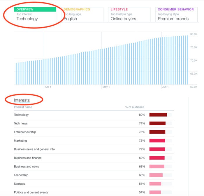
Now start sharing visual content that speaks their language. Offer up solutions, inspiration and education around those topics.
15. Choose or create landscape-oriented images
The images most suited for Twitter posts are landscape with dimensions of 1280 x 720 or 1200 x 627.
If you want to create an image that fits, use tools with pre-created templates.
Canva, Relay and Quotes Cover give you options without the headache.
16. Add hashtags, keywords, and links to image descriptions
Why use hashtags on Twitter?
- Tweets with 1-2 hashtags have 21% more engagement
- Users are 55% more likely to retweet when there is at least 1 hashtag included
- 25% of tweets without hashtags do get retweeted
- But 40% of tweets with hashtags get retweeted
Still not a hashtag believer? It's time to get onboard!
But you don't want to use any old hashtag in your tweets. The hashtags most relevant to your business are the ones that will increase engagement.
They'll also work to connect you with the right people and generate traffic.
17. Create behind-the-scenes posts
If your business allows it, take and post behind-the scenes photos of your team members.
Everybody loves a sneak peek into your day-to-day. Heck, that's what social media is all about. Voyeurism on a very real level.
Have fun with your images. Share pics from your latest meeting, event or conference.
Not only will they capture attention, they'll also create a bond between you and your audience. It gives them unique insight into your business, making them feel as if they're in on the secret.
Your audience wants to learn about you. Let them!
18. Make it is consistent with your brand identity
Everything you post on Twitter becomes a part of your social media identity. This makes it critical that you don't tweet out willy nilly.
Be aware of everything you share and ensure that it rolls up into your brand style.
Your goal is to create a consistent look and feel through your visuals. You should also look to the tone, voice and personality.
Ask yourself with each tweet, is this content aligned with my brand? Is it valuable, educational, entertaining? If no, toss it!
Ask yourself with each tweet, is this content aligned with my brand? Is it valuable, educational, entertaining? If no, toss it! #TwitterTips
— Rebekah Radice (@RebekahRadice) June 16, 2016
19. Include tables, charts, and graphs in your visual posts
We've talked about Infographics, but what about short visuals? Add credibility and reliability to your tweets with charts, data, tables and graphs.
Adding informative details to your tweets is an easy way to explain and simplify the content.
Make it easy for followers to understand and process the information.
20. Variety is the spice of life
Your Twitter followers don't want to look at the same type of visual content day in and day out.
Don't be afraid to change it up! Test, test, test to find your perfect mix of visual content.
Add photographs, quotes, tips, graphs or charts. Whatever grabs your attention is likely to do the same for your audience.
Diversify and lighten up the mood of your tweets. Inject your personality and bring your unique point of view to the context of your visuals.
21. Use videos and gifs to get interactive
Are you using videos and gifs on Twitter? If not, you're missing a big opportunity to engage your audience.
82% of Twitter users say they watch video content on Twitter. Another 70% say they only watch video they discover on Twitter.
Videos, no matter where you look, are engaging users on Twitter. Why not make them your videos?
Gifs are another fun way to get your followers to take part in the conversation. Hubspot uses them to draw attention to certain posts.
Just take a look at this one. As a fan of Saturday Night Live, this made me laugh - and click.
Social Media Managers- we appreciate you. Here's a free content calendar, cause you rock. https://t.co/V5WffnXVc4 pic.twitter.com/WKhRXLgkFD
— HubSpot (@HubSpot) June 13, 2016
Final Thoughts
Visual marketing is no longer an option.
It's a must for any business eager to drive more engagement, sales and traffic with Twitter.
So what are you waiting for? Take advantage of the multitude of ways you can be creative and use visual content on Twitter!




ViewHide comment (1)