 Do you follow your favorite restaurants on Facebook?
I know I do. And not just my favorites.
I follow dozens of local restaurant Pages -- and in the last year, I've been watching how they market themselves on Facebook.
Some do an awesome job, while others could work harder (and smarter) to get more fans & leverage Facebook for all it's worth.
In this post, I'll review 50 Facebook pages of restaurants across the United States -- one in each state -- using the following 5 criteria:
- Cover photo
- About section
- Tab apps
- Posts
- Engagement
My goal is to show you a nice variety of restaurant Pages -- so you can see how restaurants of all shapes & sizes are connecting (and not connecting) with fans.
Key Takeaways
Normally on a post like this, I'd wait until the conclusion of the post to offer takeaways. But this list is so long that I thought I'd better put them upfront.
So before jumping to the alphabetical list below, here are my main tips to help your restaurant get more fans, convert more fans into customers & generate bigger ROI with Facebook.
1. Cover photo
- Use a high-quality, beautiful, branded cover photo
- Include a caption on the cover photo -- so if a fan clicks it, they can read something & click a link to your website
- Profile photo should be branded & optimized to look great in the news feed
Resources:
- 17 Wicked Ways to Use Your Facebook Cover Photo
- 3-point Checklist for a Great Cover Photo on Facebook
- Insanely HUGE List of Image Dimensions for Facebook, Twitter and More
2. About section
- Make sure it's complete & includes:
- Contact info -- including your website & phone number
- Hours of operation
- Services & food type
- Price range & payment methods
- Description, history & any other unique info
3. Tab apps
- Make use of them! -- for contests, reservations, events, etc.
- Add high-quality images as thumbnail images -- use colors consistent with your branding!
- ALWAYS hide the fan count tab app
Resources:
- 7 Ways to Promote Your Facebook Apps Without Spending A Dime
- How to Add/Change an App Thumbnail Image on your Facebook Page
- Here’s How to Choose the Right Promotion App for Your Facebook Page
4. Posts
- Post consistently (every day!) with a good mix of post types, including:
- text updates: questions & fill-in-the-blanks
- photos (funny, inspirational, or of your food!)
- links to your website
- Use contests & giveaways to incentivize visitors to:
- give you their email address
- check-in at your restaurant
- comment on your posts
Resources:
- How to Use Facebook Posts to Drive Traffic to Your Website & Get Customers
- Increase Engagement on Facebook Posts with NEW “Hot Threads” Tactic
- 8 Facebook Contest Ideas You Can Run on Your Timeline TODAY
- Write better Facebook Status Updates with these 5 Templates
5. Engagement
- Respond to ALL fan posts & comments within a reasonable time period (within a day, if possible)
Resources:
- Customers Complaining on Facebook?... Here's 5 Ways to Deal With Them
- What You Do AFTER You Post is Way More Important than What You Post
- How to Manage Posts by Fans on Your Facebook Page
Those are the general takeaways that you can apply to your Page. Now let's get to the details!

50 Facebook Pages of Restaurants (ONE per State) to Learn From
Start at the top & make your way down -- or scroll directly to your state to check it out first. Up to you. :)
And PLEASE!... when you're finished, make sure to post your own favorite restaurant's Facebook Page in the comments below!
Alabama: Slice Birmingham
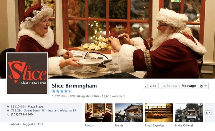
1. Cover photo
- Leverages the holiday season with a pizza twist. Great job including a brief caption with the photo!
- Should add a link to their website in caption too
- Profile photo is branded well with a logo that would be recognizable in the news feed
2. About section
- Includes contact info & hours of operation
- Provides price range, info about services, parking & the names of the restaurant’s general managers
- Description has info about ingredients & ambience served up with some tasty descriptors like “mouth-watering”, “locally grown” and “one-of-a-kind”
3. Tab apps
- Fan count app is hidden. Great job!
- Good use of tab apps for events & email capture
4. Posts
- Mostly used to highlight local sporting events, charities & daily specials at the restaurant, like pizza
5. Engagement
- While the Page sometimes Likes posts from fans, it should interact more often with fans by commenting when they post on the Page
Alaska: Simon & Seafort's
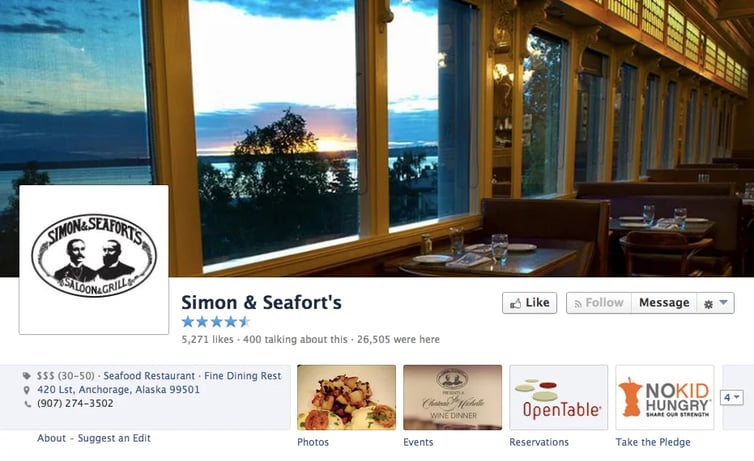
1. Cover photo
- Photo of their dining room with a beautiful Alaskan sunset is effective for showing the restaurant’s casual elegant ambience
- Caption on cover photo with link to website would help
- Profile photo could be more colorful -- to pop in the news feed
2. About section
- Includes hours of operation, how long the company has been in business & info about happy hour & the cost & style of the food
- Description is brief (“Your any time restaurant for every occasion”) and a bit vague
3. Tab apps
- Open Table app for making reservations -- awesome!
- Graphics on visible thumbnails advertise charity work of the restaurant & a schedule of upcoming events
4. Posts
- Nice mix of photos & text updates
- Lots of shots of meals, the restaurant & the surrounding area -- which looks beautiful
- Lots of articles of restaurant in the press, funny memes & even an infographic related to a cause the company is involved with
5. Engagement
- With just over 5,200 Likes, Simon & Seafort’s receives lots of engagement on its posts
- Not unusual for an update to receive 50-100 Likes or more
- Lots of positive reviews posted on the Page -- but as a Page owner, you can always do more to build a better fan relationship.
Great post here showing off hard work in the kitchen:
Arizona: REHAB BURGER THERAPY
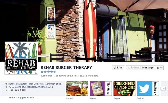
1. Cover photo
- Sunny cover photo from outside the restaurant makes me want one of their burgers
- Should add a text caption with website link to photo
- Logo provides an interesting profile photo for the news feed
Btw, here's another great resource for Cover photo ideas:
2. About section
- Includes contact info, along with info about the food, staff, hours of operation & press mentions
- Fantastic job using the beach theme to describe the restaurant
3. Tab apps
- Cool menu app
- Nice looking Twitter feed app
4. Posts
- Awesome branding! Many of the images are branded with the company’s logo, which looks great!
- Rehab & beach themes are used throughout the posts as the company advertises specials & encourages fans to check-in on Facebook
5. Engagement
- Decent job interacting with fans who post on the Page
- Many positive reviews have been posted
Here's a colorful photo post announcing an event:
Arkansas: Tilted Kilt Pub, Fayetteville
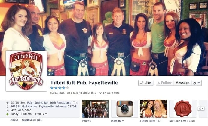
1. Cover photo
- Shows how you can use your staff to help brand your Facebook Page
- Nice, professionally branded profile photo
2. About section
- Branding is carried through to the About section
- Includes contact info, hours of operations, price range & types of food
3. Tab apps
- One tab highlights their Instagram feed -- very cool!
- Another is used to collect email addresses from fans for the “Kilt Clan” club
- “Future Kilt Girl?” link is intriguing (but this & the fan club page did not load for me)
4. Posts
- Tons of photos of their buxom server staff -- which definitely get a big response
- They're obviously targeting a specific demographic
5. Engagement
- Page does a great job at speaking directly to fans
Here's a text only post that mentions their seemingly famous server girls:
California: Hodad's
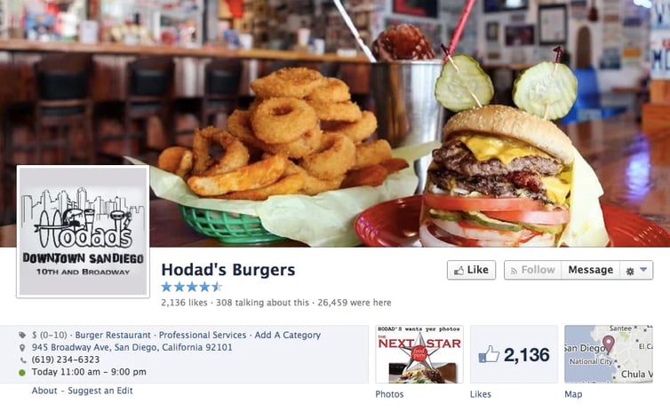
1. Cover photo
- Known for killer burgers, ambience & an awesome logo, Hodad’s cover photo attempts to present all 3
- Profile photo could be more colorful -- probably doesn't pop well in the news feed
2. About section
- Thorough coverage of all the necessary items -- including a history of the restaurant
- This is Hodad’s 2nd location in San Diego -- which is made clear
3. Tab apps
- Not really using any creative tab apps to run contests or help increase sales with Facebook
4. Posts
- Page doesn't post very often -- but the Burger of the Day often gets a large number of Likes for a Page with just more than 2,100 fans
5. Engagement
- Page for original Hodad’s has more than 20,000 Likes -- this page is trying to get there too
- I chose this Page because it shows how an established brand is working to get a newer page off the ground
Here's a typical Burger of the Day post:
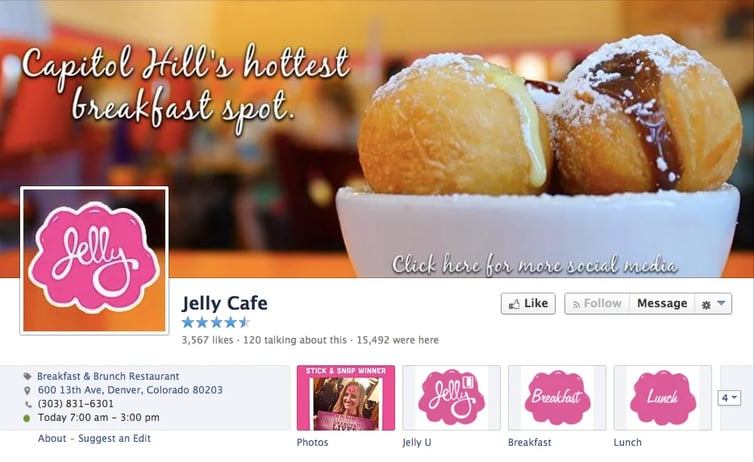
Colorado: Jelly Cafe
1. Cover photo
- Fun & appealing to the eye -- I want a donut hole, NOW!
- Great call-to-action to “click here for more social media”
- When you click the cover photo, you see a link to their website -- along with links to other social networks like Twitter, Pinterest, Instagram & Foursquare
2. About section
- Includes contact info & other important details
- Cool that they post info about the buses that stop near the restaurant. Great job!
3. Tab apps
- Instead of displaying the Like count or an app to capture email addresses, Jelly Cafe posts its menus & info about their other location
4. Posts
- Most get only a handful of Likes & comments -- but strong branding on the updates makes them effective for marketing the company on Facebook
- Lots of funny photos & memes, along with photo contests & other ways for fans to engage
5. Engagement
- Several positive reviews on the Page
- Page could probably do more to interact with their fans -- those who post often don’t receive a comment or even a Like from the company, which go far for building brand ambassadors
Here's a whacky, mashed up photo that got some Likes:
Connecticut: Max Burger
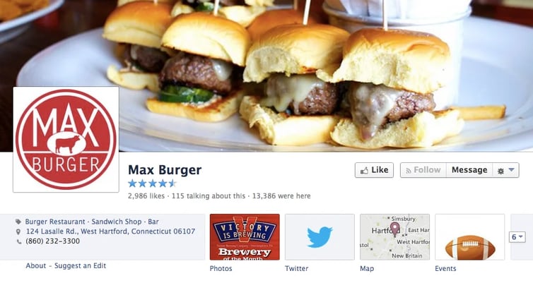
1. Cover photo
- Mmmm… sliders. This Cover photo makes me want a burger & fries!
- Nicely branded profile photo -- it's simple, colorful & will definitely pop in news feed
2. About section
- Includes a brief description along with contact info & info about parking, management & the food
3. Tab apps
- Highlights Twitter account
- Includes map to the business
4. Posts
- Refreshing to see a restaurant’s Facebook page without mainly photos of food
- Nice mix of links & text updates for fans
5. Engagement
- Level of engagement on their Page is fairly low
- Restaurants experiencing low engagement on their Pages should try experimenting with different post types as well as responding quickly to fan posts to get the engine started
Here's a post with a beer tap update:
Delaware: Delaware Distilling Company
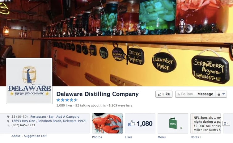
1. Cover photo
- Definitely piques my curiosity
- No caption on cover photo -- so an opportunity was missed to communicate with fans & send them to the restaurant's website
2. About section
- Effective for marketing the restaurant's “naturally flavored spirits”
3. Tab apps
- I love being able check out the menu right on the Facebook Page!
4. Posts
- Having only joined Facebook in 2013, here is another example of a unique restaurant trying to build a following on the social network
- Often highlight local events
5. Engagement
- Room for improvement in responding to fan posts & comments
Here the Page capitalized on a local event to market some lobster madness:
District of Columbia: Busboys and Poets
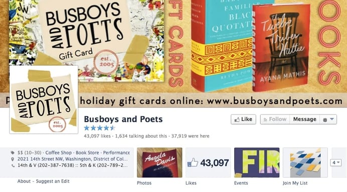
1. Cover photo
- Colorful cover photo & fun logo displayed as the profile photo tells me this is not your everyday coffee shop
2. About section
- Describes the establishment’s philosophy while providing useful contact info & descriptions of the food & services
- Links to other social media & ways to provide reviews of the restaurant
- Info about public transportation makes it easy to find a ride
3. Tab apps
- Updated events calendar keeps patrons in the know
4. Posts
- This is a bookstore as well as a coffee shop, so there is lots to discuss on Facebook
- Fans often respond to posts about books, writers, current events & events taking place at the shop
5. Engagement
- Sporadic -- page can get 100+ Likes on 1 post but the next couple posts garner only a few Likes, comments & shares
Book recommendations are often popular at Busboys and Poets:
Florida: Choices Cafe Vegan/Raw Vegan/Organic
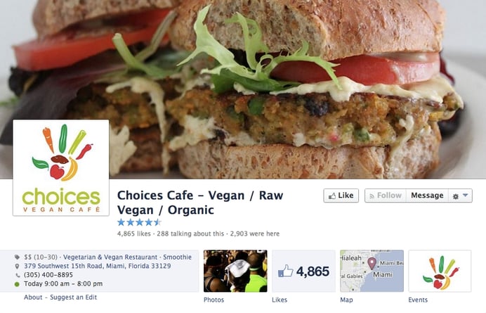
1. Cover photo
- Anyone up for a garden burger? You will be after seeing the cover for Choices Cafe. This vegan food looks tasty, and the logo doesn’t hurt
- Colorful, branded profile photo
2. About section
- Contact info, hours of operation, a description of the food & ambiance – all the basics are there
3. Tab apps
- Events tab is branded & looks good
- Make sure to update the calendar as often as possible
4. Posts
- Using mostly photos & links
- Keeps posts interesting with photos of the restaurant & employees -- with an occasional political rant about eating vegan
5. Engagement
- Page seems to be building a strong community, with many posts receiving a steady level of engagement from fans, mostly in the form of Likes, but there are a handful of comments
And they look like friendly peeps:
Georgia: The Varsity
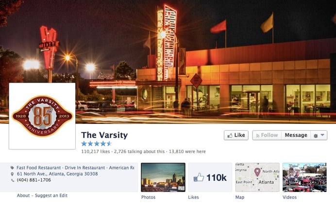
1. Cover photo
- Great job on the cover photo! I love the movement & night sky
- Solid branding on the profile photo
2. About section
- Contains the basics: a brief description of the company, contact info & links to other social networks
3. Tab apps
- Map, videos & Like count (which should be replaced)
- Since The Varsity is an established brand in the Atlanta area, there may be better uses for each of these -- a fresh contest or giveaway perhaps
4. Posts
- Excellent job posting photos (including historical pics) of scenes from the restaurants
- Along with photos of food & employees, the page posts photos from the community: sports teams, weather, etc.
5. Engagement
- The Varsity has built an impressive Facebook following. Many of their posts receive hundreds, if not thousands of Likes, comments & shares
Nice shout-out:
Hawaii: Duke's Waikiki
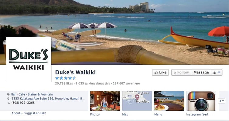
1. Cover photo
- Awesome cover photograph shows the restaurant’s close proximity to stunning Waikiki Beach
- Nice simple photo photo logo (will be easily read in news feed)
2. About section
- Description combines the restaurant’s stellar beachfront location with its steep history
- About section includes contact info, as well as info about the menu & staff
3. Tab apps
- Map to the restaurant, their menu & a link to their Instagram feed -- pics from paradise!
4. Posts
- Nice mix of photos, links & text posts
- Some posts are branded with Duke’s logo while others simply present photos with Hawaiian themes
- Text updates sometimes include strong calls-to-action – come enjoy live music or fill-in-the-blank, for example
5. Engagement
- Page often replies to fans who post on the Page, and the restaurant’s posts often receive hundreds of Likes & several shares
Awesome merchandising here:
Idaho: Boise Fry Company
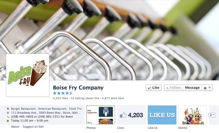
1. Cover photo
- Interesting cover shot! Fry sauce? But please explain with a caption!
- Simple & clean
- As is profile photo – which is branded well with the company logo
2. About section
- All of the basics
- Touts its vegetarian & vegan meals. Makes sense!
3. Tab apps
- Thumbnails used to request Likes & show a schedule of events
- Could link menu to a thumbnail or offer an incentive for fans to submit their email addresses
- Hidden tab app provides links to a place to leave a review
4. Posts
- Posts make it clear the business wants a strong presence in the community
- Whether posting about a local cause, sports team or item in the news, Page does well managing the interesting, entertaining & promotional
5. Engagement
- They do not post as often as other restaurants, but fans seem to appreciate the lighthearted mix of photos, links & text updates.
Now that sounds like a tasty burger topping:
Illinois: Next Restaurant
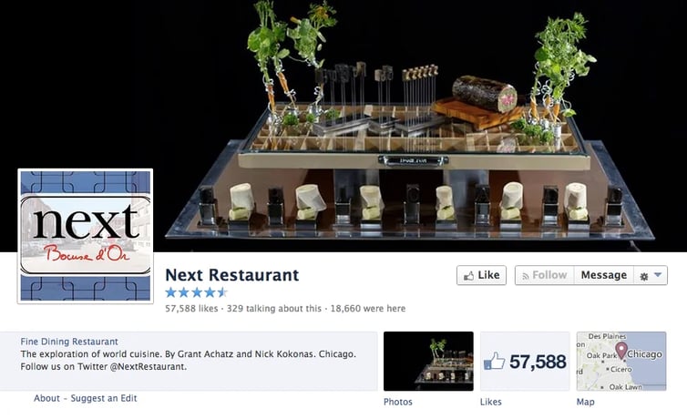
1. Cover photo
- Presentation is apparently as important as the food. Well done!
- Profile photo is a little busy -- could be simpler, with more contrast to pop in news feed
2. About section
- Includes contact info with an at times humorous description of some upcoming new developments at the restaurant
- “The exploration of world cuisine”… Intriguing
3. Tab apps
- Should replace Like count app with a menu, reservations, contest or promo app
4. Posts
- Interesting mix of mostly photos & text updates
5. Engagement
- Level of engagement on posts on Page varies greatly, from just a handful of Likes & comments on some posts to nearly 100 & several hundred on others
- Finding a table at Next Restaurant can be tricky -- one fan told me that she appreciates when Next posts last-minute availability on the Facebook Page
Use your Page to advertise unique dining opportunities:
Indiana: Indianapolis Colts Grille
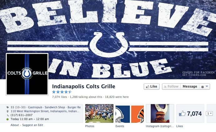
1. Cover photo
- Consistent branding on this Page shows the power of messaging targeted at a specific audience, even if you don’t have an NFL team to promote
- Logo in Profile photo is probably hard to read in news feed -- they may want to go with just the circle logo (enlarged to fill the space)
2. About section
- All the basics
- Including specialties
3. Tab apps
- Thumbnail links to an events calendar with NFL football games -- relevant & valuable for fans
- Should replace Like count app with something more valuable
4. Posts
- Definitely focused on local sports teams
5. Engagement
- Would probably encourage more engagement if they responded more often to fan comments
They definitely like to talk all things football:
Iowa: Zombie Burger + Drink Lab
1. Cover photo
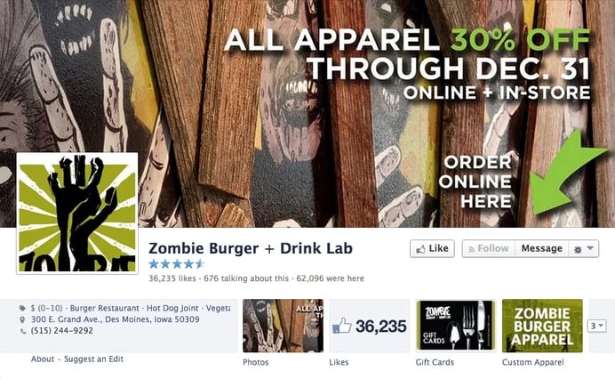
- Keeps the zombie thing fresh with an interesting cover shot & a logo that makes me want to learn more
- Profile photo logo should be fitted to the space so the bottom is not cut off
2. About section
- Lots of great info on how to contact the restaurant, hours of operation, and the price & style of the food
3. Tab apps
- Gift cards & merchandise – which got me to click over to the store
- Should replace Like count tab app
4. Posts
- Appetizing food photos accompany lots of zombie-themed links, including artwork, that will have you scrolling for more
5. Engagement
- Page is good at interacting with fans
- Posts on the page often receive a healthy number of Likes, comments & shares
Here some artists have a captive audience:
Kansas: The Free State Brewing Co.
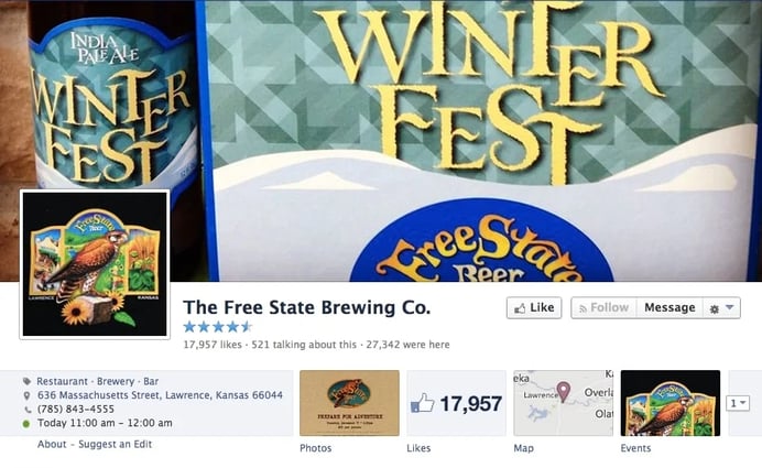
1. Cover photo
- Nice use of the cover photo to promote a seasonal offering like Winter Fest IPA
- Profile photo should be simpler -- details will be lost in smaller news feed version
2. About section
- Contact info, hours of operation, and info about staff, parking & the menu
- Great job presenting their history & the brewing process
3. Tab apps
- Events tab is a nice touch, but should be updated with new info
- Twitter feed (which probably converts some fans to Twitter followers)
4. Posts
- Nice mix of photos, links & text posts
- Timeline is not overwhelmed by food shots
- Include quotes, info about the brewing process & fun factoids from the local area
5. Engagement
- While the numbers of Likes, comments & shares on many posts are high, the restaurant could boost engagement even further by interacting more with fans on the Page
Here's a post that leverages an important local sporting event:
Kentucky: Taco Punk
1. Cover photo
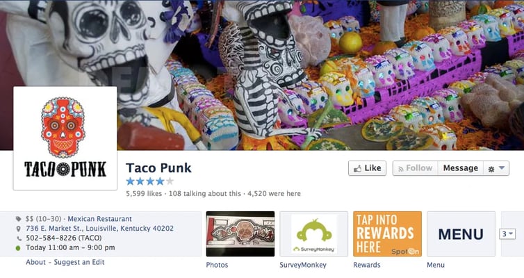
- Great cover & profile photo
- Cool Mexican-themed cover & logo
- may want to enlarge logo in profile photo a bit (to fit space & be larger in new feed)
2. About section
- Great description that includes info about the ingredients used at the restaurant
- Contact info, hours of operation & price range
- I always like seeing restaurants include information about public transportation!
3. Tab apps
- Hides the Like count (nice!)
- Customer survey
- Restaurant’s menu
4. Posts
- Nice use of text posts that aren’t overly promotional
5. Engagement
- Perhaps communicate more with fans on the Page (even starting new conversations) to increase the number of Likes, comments & shares
Way to work the crew into the branding:
Louisiana: Blue Dog Cafe -- Lafayette, LA
1. Cover photo
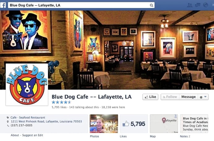
- Photo from inside the restaurant with lots of Blue Dog-themed art works well
- Great use of a logo for the profile & cover photos
2. About section
- Includes the basics: a tagline, the hours of operation & a description of services & payment methods
3. Tab apps
- Should hide Like count
- Consider promoting the Top Dog Club by asking people to submit their email address to sign up
4. Posts
- I like the text & branded posts with info about upcoming events at the restaurant
- Great use of branding throughout the posts
5. Engagement
- Ask fans to review your restaurant on the Facebook Page. This request could help spark engagement while also generating positive, authentic content
Maine: Buck's Naked BBQ and Steakhouse
1. Cover photo
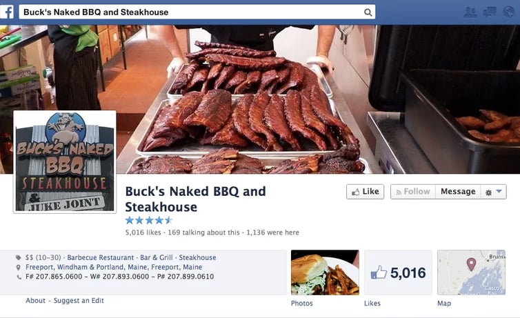
- Fun Facebook Page! I’d Like it for the barbecue cover shot alone
- Should use a digital logo instead of a photo for profile photo -- this one looks bland & illegible in news feed
2. About section
- Well-written restaurant description with important contact info, hours of operation & brief descriptions of the staff & food
3. Tab apps
- Should hide Like count app
- Could use better apps -- try a giveaway, promote specials or partner with a community charity
4. Posts
- Company's personality is displayed well in mostly photo posts
- Fun photos of employees & from inside the kitchen
5. Engagement
- Like many local restaurants, Buck’s may just need to engage more with fans to boost activity on the Page
Dude really seems to like his job:
Maryland: Crabcake Factory USA
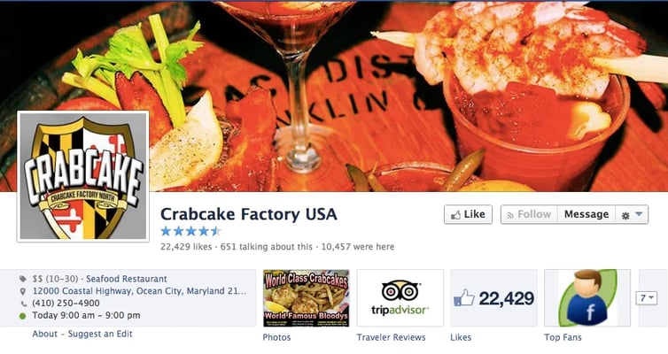
1. Cover photo
- Company is using separate Facebook Pages to brand its different locations in Maryland, using cover photos to identify different restaurants
- Should fit logo to space in profile photo -- and put it on a white background
2. About section
- Lots of great info
- All the basics
3. Tab apps
- Recognizing top fans -- a great way to build relationships!
- And reviews go far for showing transparency & authenticity
- Should replace Like count app
4. Posts
- Lots of photos of restaurant & mentions of local events
5. Engagement
- Not a lot of engagement, despite having 23k fans
- Page could be more responsive to fan posts & comments
Nice photos -- and lots of info on this post:
Massachusetts: Wahlburgers
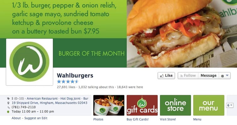
1. Cover photo
- Damn those burgers look good!
- Great use of brand colors
- Awesomely simple logo in profile photo -- nice work!
2. About section
- Contact info, hours of operation & a mention of the burger joint's famous founders
3. Tab apps
- Great job keeping the Like count hidden while letting me visit the store or view a menu
- I enjoy visiting a restaurant's store to peruse unique merchandise -- even if I don't buy something
4. Posts
- Fun mix of merchandising, food shots & posts about the Wahlbergs
5. Engagement
- Posts get lots of comments & Likes
It's good to have celebrities to fall back on (just in case):
Michigan: Cops & Doughnuts - Clare City Bakery
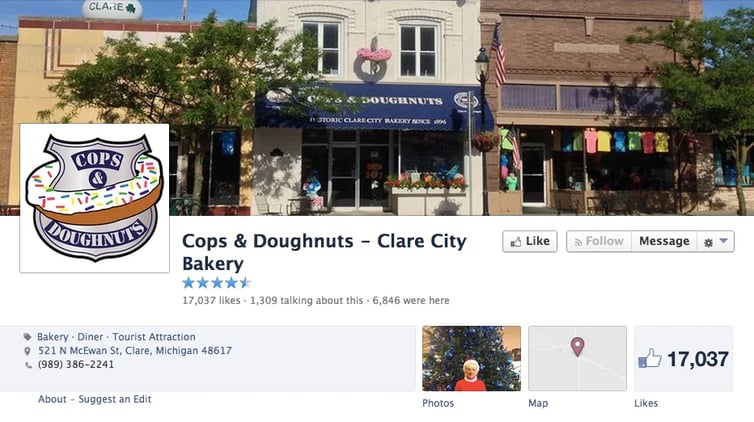
1. Cover photo
- Logo makes a fun profile photo while the cover photo shows a quaint city street that has me wanting to visit the bakery
2. About section
- Hours of operation, contact info & an awesome description
3. Tab apps
- Room for improvement here
- Sometimes a map is a great idea -- depending on the establishment
4. Posts
- I like the photos of employees, police officers & other customers enjoying the shop
5. Engagement
- Decent to high level of engagement on many of the posts, often in the form of Likes
This post proves that this place really lives up to its name:
Minnesota: Pizza Luce
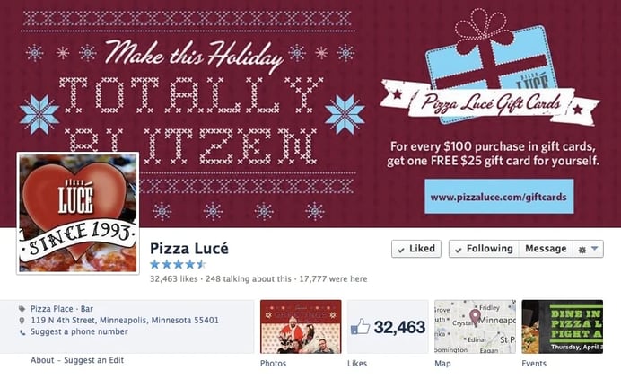
1. Cover photo
- For some restaurants, a holiday cover photo works great
- Should put logo on a white background & fit to space in profile photo
2. About section
- All the basics, but could use a little more detail
3. Tab apps
- Map
- Events schedule
4. Posts
- Great use of photos & video in posts!
5. Engagement
- Posts showing people & patrons seem to get tons of engagement
Fun way to promote a holiday gift card:
Mississippi: The Hook Up
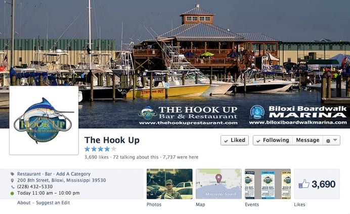
1. Cover photo
- Helps provide the sense place a destination-type restaurant should convey on their Facebook Page
- Solid logo in profile photo!
2. About section
- As if the waterfront was a tough sale, the description highlights oysters, crabcakes & coastal views
3. Tab apps
- Schedule of events
- Map
4. Posts
- They love their New Orleans Saints!
5. Engagement
- Not a lot of fan comments -- they may want to post more questions & fill-in-the-blanks
A post like this must bring in more than a few customers:
Missouri: International Tap House (iTap)
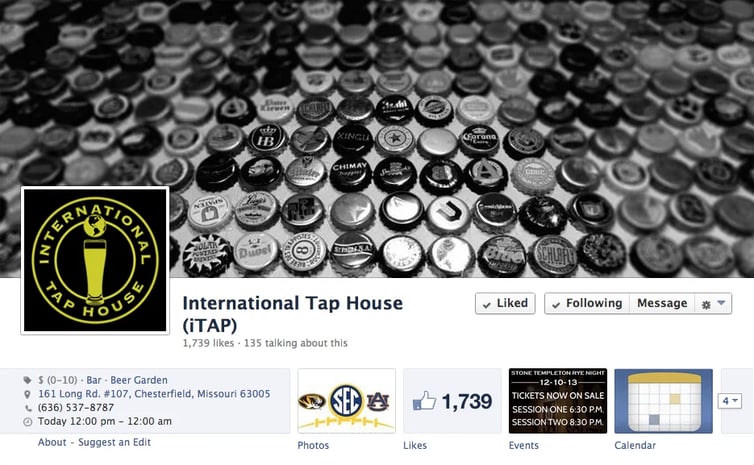
1. Cover photo
- Bottle caps are cool
- Solid logo on profile photo -- although a white background would be nicer
2. About section
- They wisely tout their other locations in the About section
3. Tab apps
- Actively post events & update their calendar
4. Posts
- Talking beer & Missouri sports with a dash of humor & snark
5. Engagement
- Posts could definitely use more engagement
This post about how to speak to your followers on Facebook may help:
The Do’s and Don’ts of Facebook Pages
They used this meme to mark an important day in history:
Montana: MacKenzie River Pizza Co.
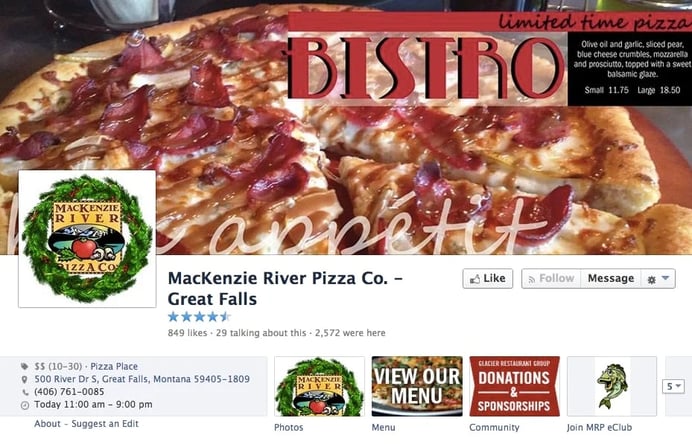
1. Cover photo
- "Limited time pizza” is a cool branding idea for the cover
- Nice holiday decoration of logo on profile photo (but be careful not to change your profile photo too often)
2. About section
- Useful info with an entertaining description of the establishment
3. Tab apps
- Displays a menu -- always an appropriate choice
- Community app is good idea -- but didn't load for me
4. Posts
- Effective mix of photos, links & text updates
5. Engagement
- Lots of fan reviews & comments on posts
Here's an awesome way to support an awesome cause:
Nebraska: Blue Sushi Sake Grill Old Market
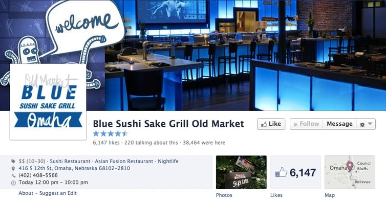
1. Cover photo
- Killer cover shot! I’ve got to check this place out
- Nice logo on white background in profile photo
2. About section
- Completed with all the basics
3. Tab apps
- Not using
- Remember -- tab apps offer great marketing opportunities for your restaurant -- even by simply linking to your menu or asking fans to sign up for a newsletter
4. Posts
- Strong branding on their posts -- should keep fans coming back
5. Engagement
- May want to test a variety of post types to find out which types of updates generate the most engagement among fans
Always know your target audience:
Nevada: Naan & Kabab
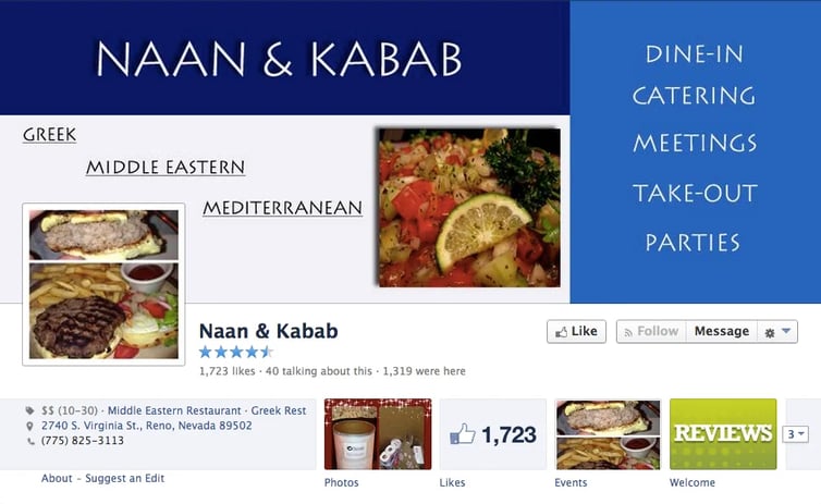
1. Cover photo
- Nicely branded, simple & clean cover photo
- Profile photo should definitely be replaced by a recognizable logo (this food will look like a blur when miniaturized in the news feed)
2. About section
- Complete with the basics
3. Tab apps
- Let visitors post reviews & view a schedule of upcoming events
4. Posts
- Nice mix of posts -- not just food shots overwhelming the news feed
5. Engagement
- May want to mix in some questions & fill-in-the-blanks to get more comments
This post aims to help the Humane Society:
New Hampshire: Wolverine Grille
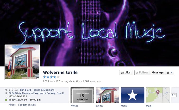
1. Cover photo
- Uses cover to promote the local music scene -- very cool!
- Should replace photo in profile photo with a digital logo -- to be more recognizable in the news feed
2. About section
- Restaurant owners need to fill out the About sections on their Facebook Pages as completely as possible
3. Tab apps
- Menu & schedule of events are visible via their tab apps
4. Posts
- Raising awareness for local music is an important part of the Wolverine Grille’s posting strategy
5. Engagement
- Fans who care about local music often post comments on the Facebook Page
- This tiny page (621 Likes) gets a ton of engagement -- nice work!
New Jersey: Chateau of Spain Restaurant
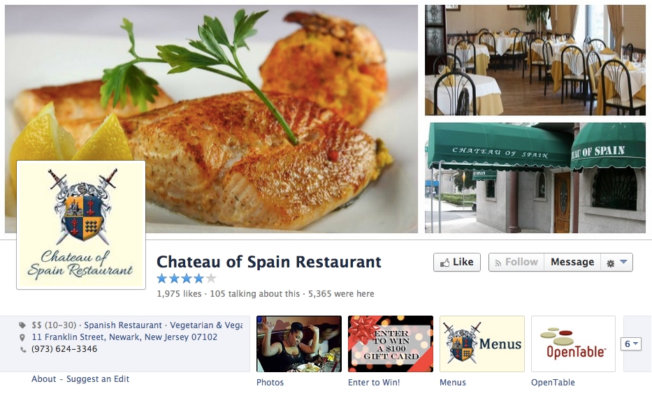
1. Cover photo
- Cover cleanly & professionally displays the restaurant, the logo & most importantly, the food!
- Should only use the shield & swords part of logo (without the type) on a white background
2. About section
- Section is complete & very informative
3. Tab apps
- Among other things, tab apps on the page display a menu & a $100 gift card giveaway
- Promoting giveaways & contests with tab apps are great ways to improve your Facebook marketing
4. Posts
- Everything from photo posts to text updates to memes are part of the posting strategy
5. Engagement
- May want to experiment with different types of posts (fill-in-the-blank, questions) to boost engagement
Fans love an inspiring post now & again:
New Mexico: Dion's Pizza
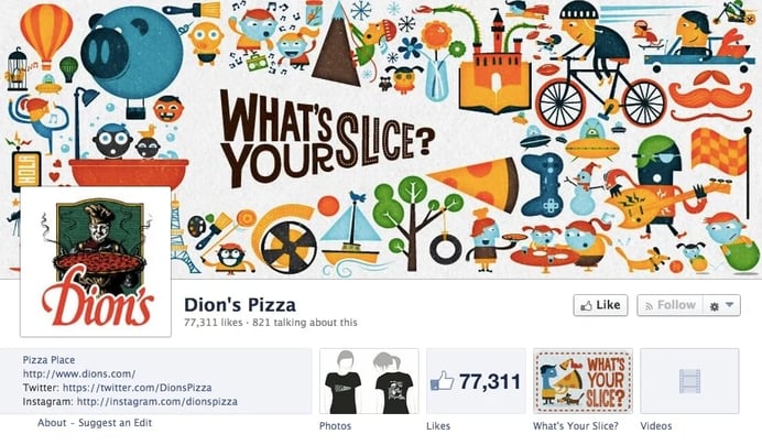
1. Cover photo
- Colorful & creative
- Awesome branding
- Simple, colorful, recognizable profile photo
2. About section
- All the basics -- but I'd recommend getting the phone number visible on page
- Highlighting awards from the local press sends an impressive message
3. Tab apps
- “What’s Your Slice” feature looks interesting
- Should hide/replace Like count app
4. Posts
- Thoughtful, creative posts
5. Engagement
- Even with a significant following, Dion’s finds time to reply to many fans who post on the Page
Branded posts like this one can do a lot for a Page:
New York: Big Gay Ice Cream
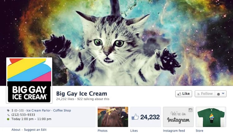
1. Cover photo
- New twist on the cat shot alongside side Big Gay Ice Cream’s logo make this Facebook Page one you can’t help but check out
- Nice simple branding on profile photo
2. About section
- All the basics plus some other social media info
3. Tab apps
- I dig when restaurants have a creative line of merchandise to help promote their joint
4. Posts
- Lots of pop culture references enter the discussion on the Page
5. Engagement
- Hundreds of people have engaged with posts on the Page -- nice work!
Of course use Facebook to invite everyone to your birthday party:
North Carolina: Tupelo Honey Cafe
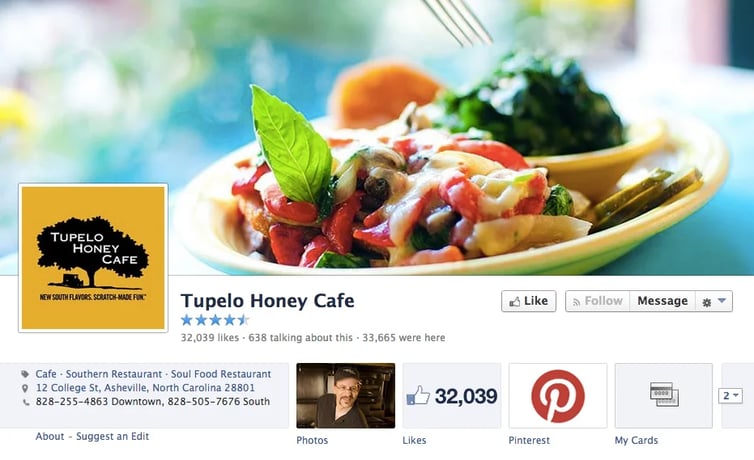
1. Cover photo
- Logo with a simple, clean cover photo combine to convey an elegant statement about the restaurant
- I'd lose the type on the profile photo and go with just the tree
2. About section
- Complete list of important items
3. Tab apps
- Link to Pinterest -- a great option for restaurants with active Pinterest communities
4. Posts
- Nice mix of posts
- They shared on the Facebook Page the excitement of opening another location
5. Engagement
- Engagement from fans is steady & strong
Nothing like a new location to get your fans talking:
North Dakota: Space Aliens Grill & Bar -- Fargo
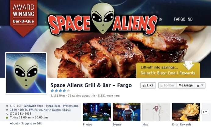
1. Cover photo
- Pretty cool branding on this page!
- Cover photo points me to an email rewards program that collects contact information -- awesome!
2. About section
- All the basics -- looks great!
3. Tab apps
- Email rewards program -- for signing up you'll receive coupons & "a special gift you can use today"
- Map
- Events schedule
4. Posts
- May want to mix in more link posts & text updates
- May want to try some questions, fill-in-the-blank, trivia & famous quotes to encourage people to respond
5. Engagement
- Mixed reviews on this Page provide an example of how opinions about a restaurant may appear
Game day specials are sometimes best advertised on Facebook:
Ohio: The Buckeye Hall of Fame Grill
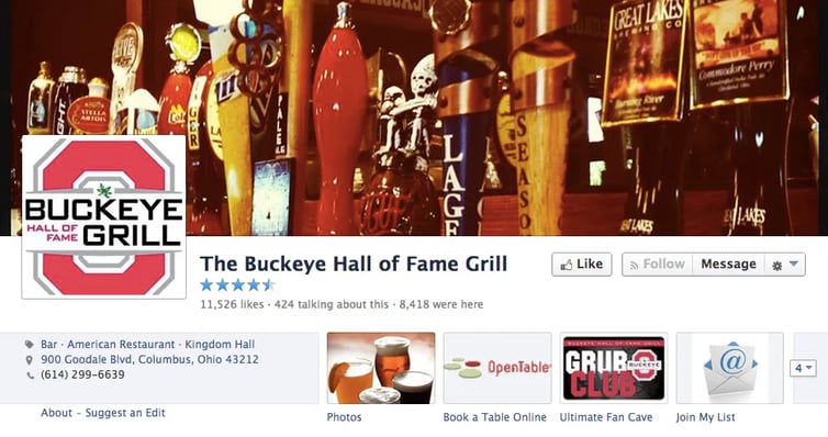
1. Cover photo
- Killer cover! I love the Ohio State University logo & memorabilia
- Solid logo in profile photo!
2. About section
- Description gets sports fans salivating:
An all-new sports restaurant concept licensed by The Ohio State University, The Buckeye Hall of Fame Grill features unique memorabilia, rarely-seen photographs, and an atmosphere that celebrates all things scarlet and gray.
3. Tab apps
- Restaurant is collecting email addresses from those who visit the Page -- great work!
4. Posts
- Lots of talk about Buckeye sports & news from Columbus in photo & text posts meant to draw people into the restaurant
5. Engagement
- There have been successful posts, but it’s also surprising that many posts do not take off, given the focus of the Page and its fans
Here are some more resources to help you create killer Facebook posts:
- Instantly Discover Which Posts Work Best on Your Facebook Page
- Who Else Wants to Get More Comments in Your Facebook Posts?
- 3 Kinds of Facebook Posts that Get Crazy Likes and Comments
This rockin' post really shows off the scene:
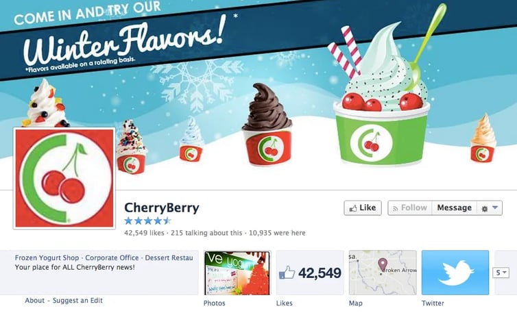
Oklahoma: CherryBerry
1. Cover photo
- Seasonal cover promotes tasty winter treats
- Simple logo in profile photo -- will look great in news feed!
2. About section
- Lots of great info about the company, along with contact info & links to the website
3. Tab apps
- Using Twitter, but should replace Like count app
4. Posts
- CherryBerry's branded posts are awesome!
5. Engagement
- For a Page, less promotional content often has the potential to boost engagement among different types of Facebook fans
A Throwback Thursday with lots of kids just can't miss:
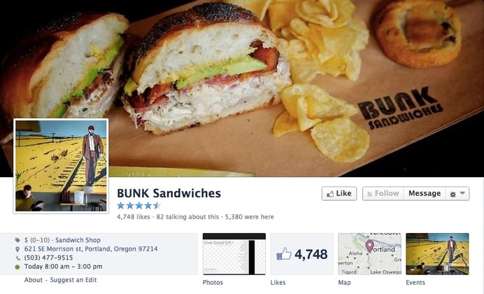
Oregon: BUNK Sandwiches
1. Cover photo
- Solid branding in the cover photo provides some freedom for the sandwich shop
- Should replace profile photo image with a branded logo that will pop in news feed
2. About section
- Complete profile with a brief, tagline-like description
3. Tab apps
- Map
- Events schedule
4. Posts
- Great job posting fun, relevant topics from pop culture while leveraging events locally, especially the NBA… cool memes!
5. Engagement
- Memes seem to have received some of the highest engagement numbers
- Good lesson for Pages struggling to create original content
This meme should have gotten a lot more Likes:
Pennsylvania: Primanti Bros.
1. Cover photo
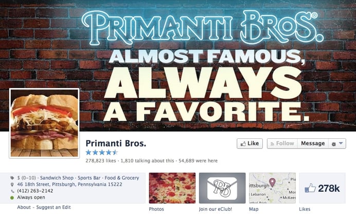
- Cover photo is branded perfectly alongside the tight sandwich profile photo
- The sandwich looks tasty, but I wouldn't recommend it for a profile photo
2. About section
- Links to the website & other social media
- Contact info
- Parking
3. Tab apps
- In asking visitors to submit their email address, one visible tab app offers “Double Meat” and other free stuff for participating in the eClub
4. Posts
- Many of the posts are branded – which helps carry consistent messaging throughout the Page
5. Engagement
- Recent photo of Jimmy Fallon visiting Primanti Bros received more than 22,000 Likes, nearly 500 comments & more than 1,500 shares
Make sure to always promote food & drink specials:
Rhode Island: Boneheads Wing Bar
1. Cover photo
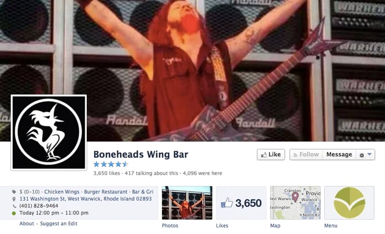
- Page rotates its cover photo based on events in community -- or even to recognize one of their favorite musicians
- When I visited, the page had a photo of late Pantera guitarist Dimebag Darrell, and posts commemorating the musician’s death
- Other recent cover photos have highlighted the Boston Red Sox & promotions at the restaurant
- Perfectly simple profile photo!
2. About section
- All the necessary info – with a tasty description of the wings
3. Tab apps
- Useful tab apps visible at the top of the page include a menu & map
4. Posts
- Coherent, consistent messaging delivered with different types of posts keep the Timeline poignant & fresh
5. Engagement
- Steady number of people Like most posts
Sometimes you build relationships with fans in more solemn ways:
South Carolina: Carolina Roadhouse
1. Cover photo
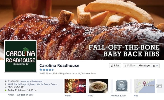
- Clean cover photo with well-placed text
- Logo is a good fit for posts appearing in the news feed
2. About section
- All the basics, including payment options
3. Tab apps
- Bonus for hiding fan count!
- Menu
- Email list -- with special offers for signing up
- Map
4. Posts
- Nothing super unique, but solid feed with lots of photos showing food & fans
5. Engagement
- People post on the page & Carolina Roadhouse often responds
- Posts enjoy steady engagement from fans
Effective Cyber Monday promotion here:
South Dakota: Wall Drug Store, Inc.
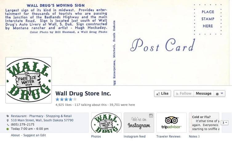
1. Cover photo
- Back of an old postcard provides an intriguing & entertaining cover photo while also helping set the mood for the Page
- Awesome logo on profile photo (with white background!)
2. About section
- With a place like Wall Drug, you’d be crazy not to include some of the history of the establishment in the About section
- Whenever restaurants have interesting pasts, and many do, these events should be highlighted in the business description
3. Tab apps
- Visible tab apps provide reviews, a link to the Instagram feed & notes from Wall Drug staffers -- a nice touch!
4. Posts
- Health tips to local travel ideas -- Wall Drug shows that destination-type restaurants can enjoy robust personas on Facebook
5. Engagement
- Wall Drug does a good job acknowledging fans on the Page
Engage with fans by sharing their posts on your Page:
Tennessee: Sticky Fingers - Chattanooga Downtown
1. Cover photo
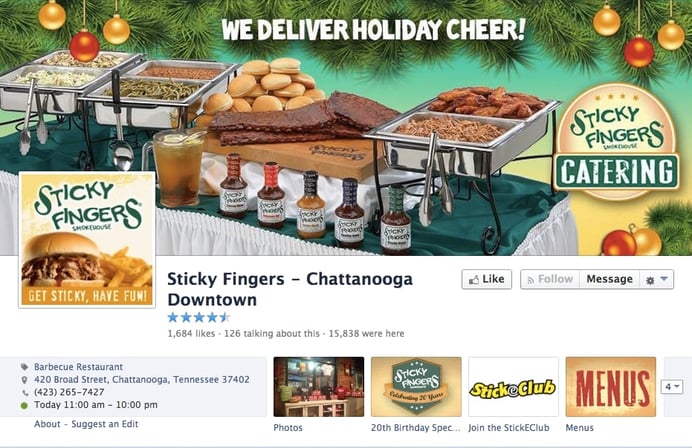
- Subtle holiday-themed cover photo presents a call-to-action without getting in the visitor's face
- I'd remove the food from the profile photo -- and leave just the logo on a white background
2. About section
- Contact info
- Hours of operation
- Description of the business
3. Tab apps
- Have labeled their tab apps well -- but some of the tabs were not working properly when I tried
4. Posts
- Branded posts & merchandising on the Page
5. Engagement
- When your Page is still working to build a following on Facebook, interact with the fans you do have to nurture your online community
Fans always want T-shirts from their favorite restaurants:
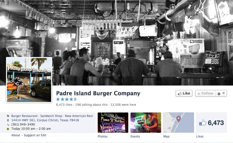
Texas: Padre Island Burger Company
1. Cover photo
- Cover is a photo from inside the restaurant while the outside is used to brand the profile photo
- Logos are always more recognizable in the news feed as profile photos
2. About section
- Brief description: Burgers, burgers, burgers!
3. Tab apps
- Visible thumbnails near the top of the Page show an events schedule, a map & the fan count
4. Posts
- Lots of great stuff to post, including branded updates from the restaurant, photos of customers & riffing on current events in the community
5. Engagement
- Page experiences a steady amount of engagement from its roughly 6,500 fans
Here's a post promoting what looks like a fun day:
Utah: Flanagan's On Main
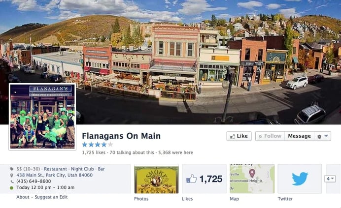
1. Cover photo
- Awesome shot of Flanagan's on Main with Park City in the background!
- Employee group shot helps brand profile photo -- cool, but not ideal for a profile photo (use a recognizable logo!)
2. About section
- Always good to get a full description explaining everything from the ambiance to specialty dishes. Flanagan's has that!
3. Tab apps
- OK tab apps hidden from the visible thumbnails
- Instead of displaying their Likes, restaurants should try using thumbnails to advertise a giveaway, display their menu or encourage fans to check-in on Facebook
4. Posts
- There is definitely a place for text updates here
5. Engagement
- Visitors post comments on the Page
- Page could engage more with fans, even with a simple Like or comment
Some hot treats on a cold winter day:
Vermont: Vermont Pub & Brewery of Burlington
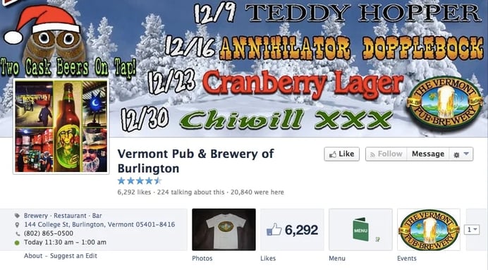
1. Cover photo
- Though a little busy, cover photo is branded for the season & provides information many of the pub’s beer-loving customers will appreciate
- Should replace profile photo with a logo
2. About section
- Updated About section gives nod to this year’s 25th anniversary while providing contact info & the hours of operation
3. Tab apps
- Page uses visible apps mostly for the menu & an events schedule
4. Posts
- Lots going on on this Page -- merchandising & branded company announcements alongside food shots & photos from around Burlington
5. Engagement
- Some posts do better than others, with photos often getting a healthy number of Likes
All kinds of great garb:
Virginia: Mahi Mah's
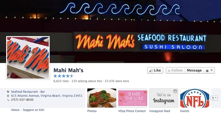
1. Cover photo
- Simple & clean cover photo has interesting colors & presentation, and brands the company well right up top
- Logo on the profile photo isn’t a bad idea, but it should be sized differently to fit in the space -- remember, this the first things people notice in the news feed when seeing your posts
2. About section
- Description provides links to the restaurant’s website & other social networks
3. Tab apps
- Though there is a Valentine's Day contest on one of the thumbnails that has expired, at least Mahi Mah’s doesn’t show their fan count in the row of visible tab apps -- they instead display an events calendar & their Instagram feed
- Hidden app shows daily specials at the restaurant
4. Posts
- Periodic posting with an interesting mix of photos, links & text updates make for an interesting news feed from Mahi Mah’s
5. Engagement
- Fans post on the Page & a handful interact with most posts
The right meal post can say a lot:
Washington: Dick's Drive In Restaurant
 9
9
1. Cover photo
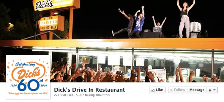
- Tough to beat the shot of local musician Macklemore doing his thing on the roof of Dick’s
- Restaurant’s 60th anniversary logo is a nice touch
2. About section
- Links to Dick’s website & Twitter feed along with contact information, the restaurant’s hours & info about parking
3. Tab apps
- Pages should use tab apps as ways to incentivize fans to take action -- submit an email address, sign up for a newsletter, etc.
- “Dick’s Deluxe Fan” tab offers ways to win free food & prizes for registering
4. Posts
- An institution in Seattle, Dick’s obviously puts lots of thought into their posting strategy
- While touting the area & the restaurant’s history, the company weaves in promotional items with information about charitable pursuits & upcoming events
5. Engagement
- With 221,000 fans, sometimes posts from Dick’s receive more than 1,000 Likes
- Establishment keeps followers involved by interacting with them on the Facebook page
I WANT one of those T-shirts:
West Virignia: DJ's 50's and 60's Diner
1. Cover photo
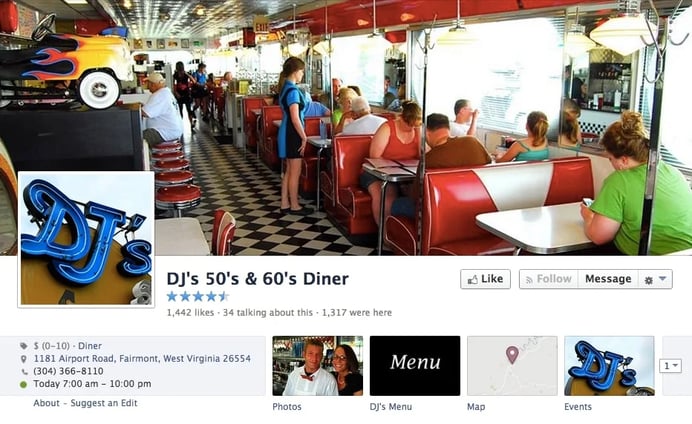
- Cover photo from inside the diner has depth & movement – making me want to visit the place
- While the profile photo could probably be sized better, when I click the cover photo I can read a nice description of the company & a thank you for visiting the Page
2. About section
- Complete About section with a description of the business, contact information, hours of operation & information about the food & restaurant’s services
3. Tab apps
- I love that DJ’s doesn’t show a thumbnail with their Like count
- The company uses that space for the menu, a map & a schedule of events
4. Posts
- Page posts regularly (every few days or so) – posts are a combination of food & people photos, and information about local happenings like sporting events & other activities
5. Engagement
- People leave positive reviews on the Page
- Page often interacts with fans
They tried to tell it like it is with this post:
Wisconsin: Brett Favre's Steakhouse
1. Cover photo
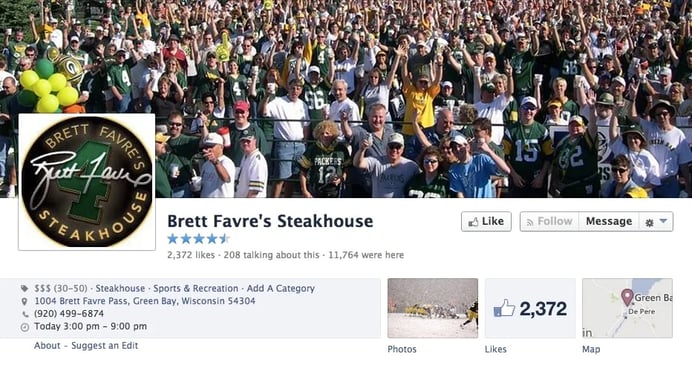
- Sports is a common theme when restaurants brand themselves, but this Green Bay Packers cover shot is FOR REAL!
- Nice logo in profile photo
2. About section
- Of course the description touts Packers & Brett Favre memorabilia that hangs in the establish
3. Tab apps
- Gotta work on those tab apps, guys
- How about a contest, giveaway or a Brett Favre’s Steakhouse fan club?
4. Posts
- There are lots of football-themed posts, funny memes & text updates
- With just over 2,300 Facebook Likes, posts from the Page generally receive a decent amount of engagement
5. Engagement
- Seems to be opportunity here to build a strong community on the Page. Make sure you interact with your fans by Liking & commenting when they post on your Page
Snow at Lambeau brings Likes to a post:
Wyoming: Wyoming High Country Lodge
1. Cover photo
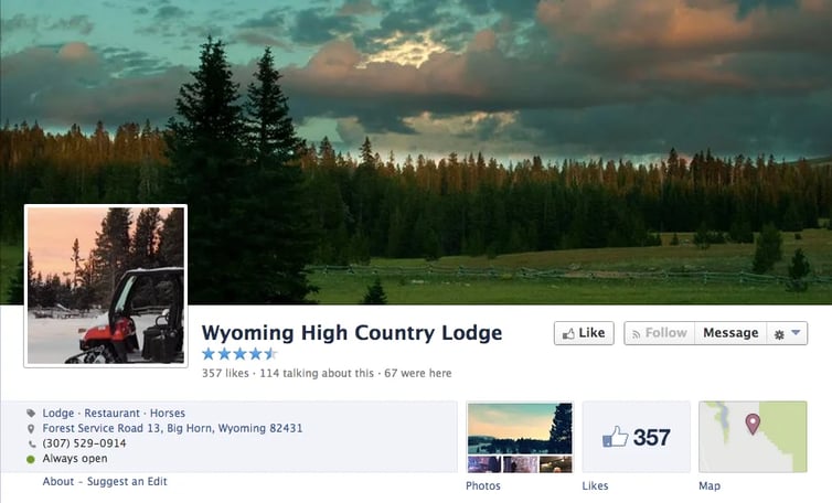
- Seasonal cover & profile shots show why someone would want to visit the Wyoming High Country Lodge
- Profile photo should have a branded logo
2. About section
- All the contact info is there, as is a description of the establishment
- To brand the Page more as a restaurant the company could add menu information, the hours of operation & the price range for the food
3. App tabs
- Need to change -- remember, there is rarely a compelling reason to show how many Likes a company has, but that number should especially be hidden when the amount is small
- Map is useful, but the lodge would be better off replacing the Like count with a menu & perhaps adding a special or a way to collect email addresses from fans or sell lodge souvenirs
4. Posts
- Page posts a combination of photos & text updates. Fortunately, there are many activities happening in the area – which gives the Page lots of stuff to talk about
- Pages should post often about happenings in their local area to build community & attract visitors from other places
5. Engagement
- With only a few hundred Likes, level of fan engagement on the Page is relatively low
- A few people post on the Page and Like the posts – and lodge staffers have done an OK job replying to fans & interacting with their Facebook followers
Talk about providing some value for your fans... nice!



No Comments